UX/UI Design, Product Design
ChoreoPlan
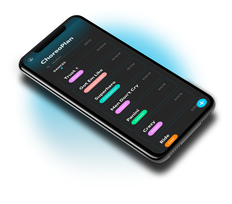
An interactive mobile planning app for all types of choreographers and dancers that plan out their dances.
DURATION
2 months
PROJECT TYPE
UX/UI Design
Product Design
TOOLS USED
Adobe XD
Overview
As part of the MIND Mentorship program, we were tasked with solving a problem with something you are passionate about. The reason I created ChoreoPlan is because I am very passionate about dance. With my own personal experience when it comes to choreography planning and being surrounded by a large dance community, I wanted to create something using my design skills that will help all types of dancers and choreographers.
ChoreoPlan is a mobile app that helps dancers use today’s technology in order to carefully plan and create beautiful dances. . This project helps lack of organization and planning when it comes to choreography and planning.
Problem
Organized Choreographers need a better way to brainstorm dances and sets because they are often having trouble planning it out in a traditional notebook.
Hypothesis
We believe that by creating an iOS app that allows dancers to jot down their dance ideas and concepts in a more organized way and create formations to see them visually beforehand, we will boost creativity and streamline dance planning.
Quantitative/Qualitative Research
To better understand my community and find more about the problem, I reached out to 25 dancers and choreographers using a google form to collect this data.
Below are some key statistics I found from this data.
68%
of the dancers surveyed
were also Choreographers
64%
of the dancers surveyed
danced 5+ years
56%
of the dancers surveyed
plan in their heads
56%
of the dancers surveyed
both plan by themselves
and collaborate with others
80%
of the dancers surveyed
use an iOS device
In addition to the quantitative data above, I interviewed other dancers to learn how they think and why they think this way. Some notable statements were:
- "I use ChoreoRoom to visually look at my formations and sometimes I draw in the notes app"
- "I tend to keep everything in my head but it would be nice to have something to look back to for reference."
- "Things aren't always going to work out the way you want it in your head."
- "The hardest part is remembering your creation."
- "The process honestly differs from time to time. The process is that there is no process technically, mainly going with what feels right."
User Personas
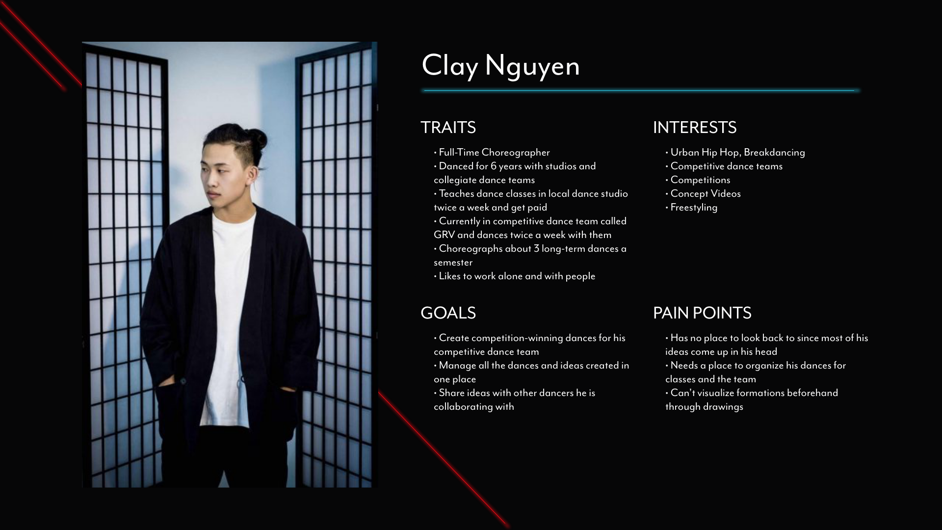
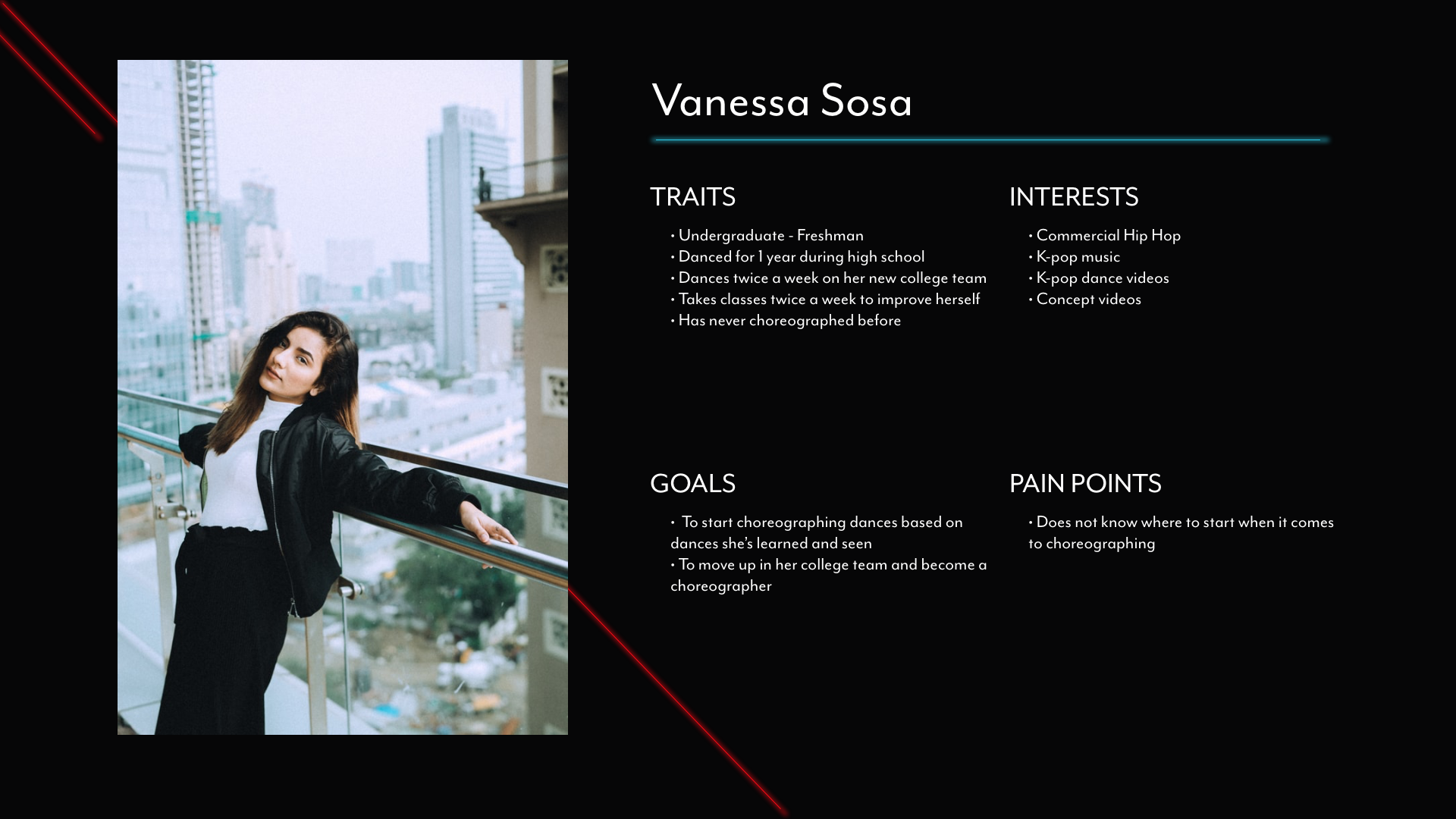
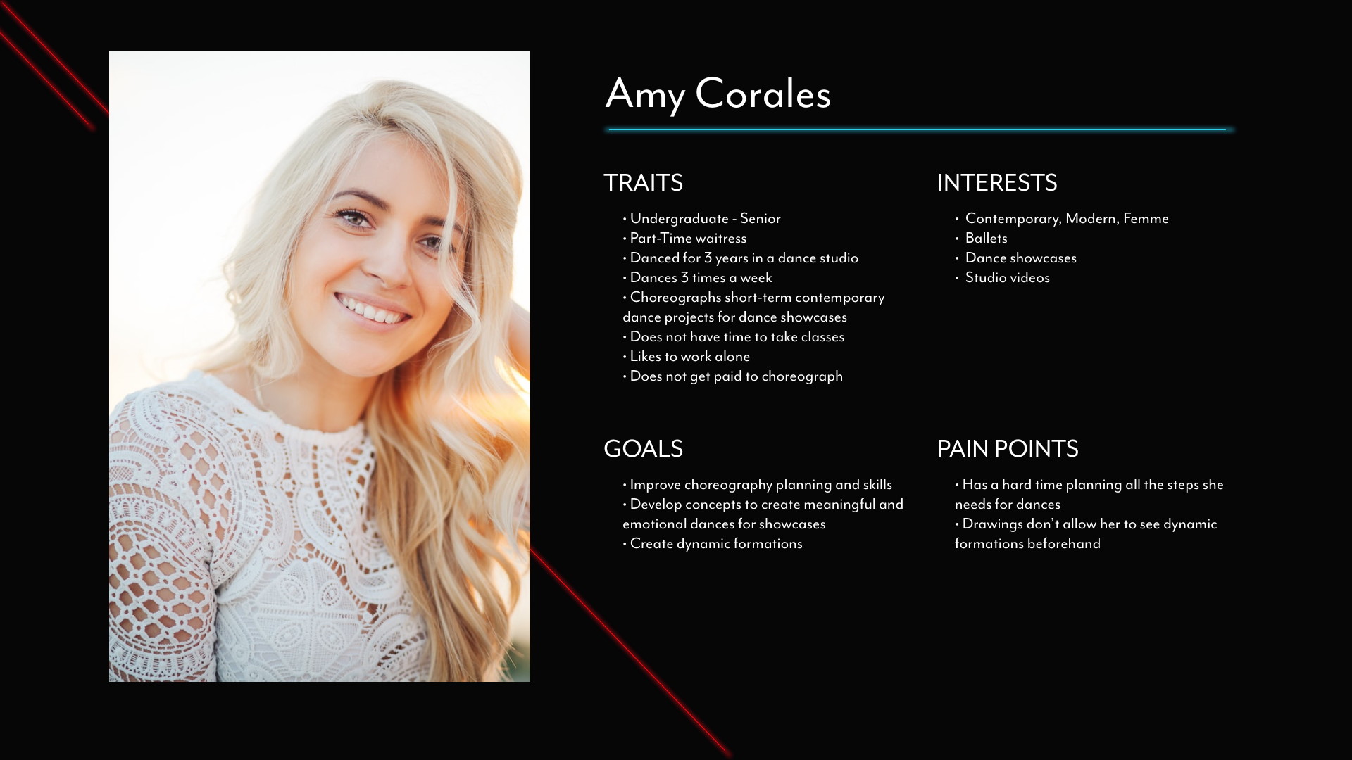
Based on the data above and my knowledge of the dance community, I created 3 different user personas (beginner, intermediate, and advanced dancers) and pinpointed what each of their needs may be based on their experience.
Setting the Mood
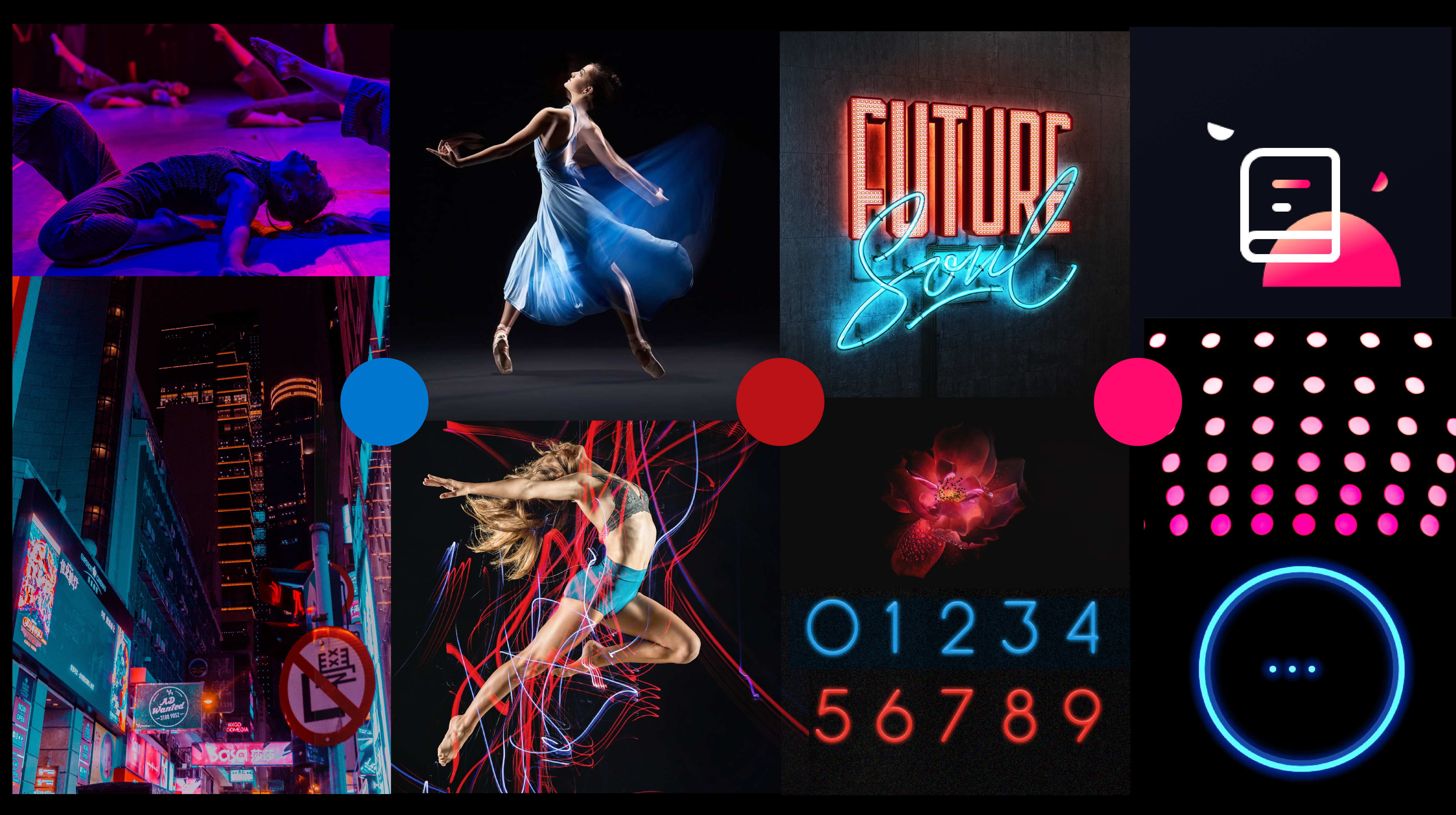
To make my app stand out and appeal to the dance community, I created a moodboard to visualize certain moods I wanted my app to show:
- Sense of movement and energy
- Self-expression
- Stimulate productivity
- Minimal surroundings with a key focus
Knowing the Flow
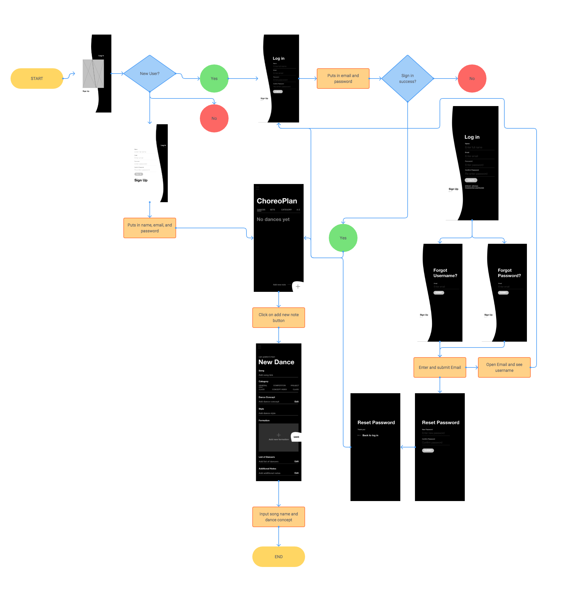
Next, I created a user flow to plan how my users will navigate through my app before I begin my wireframe designs. The User flow below shows how a user will navigate from the opening screen.
Mid-Fidelity Wireframes
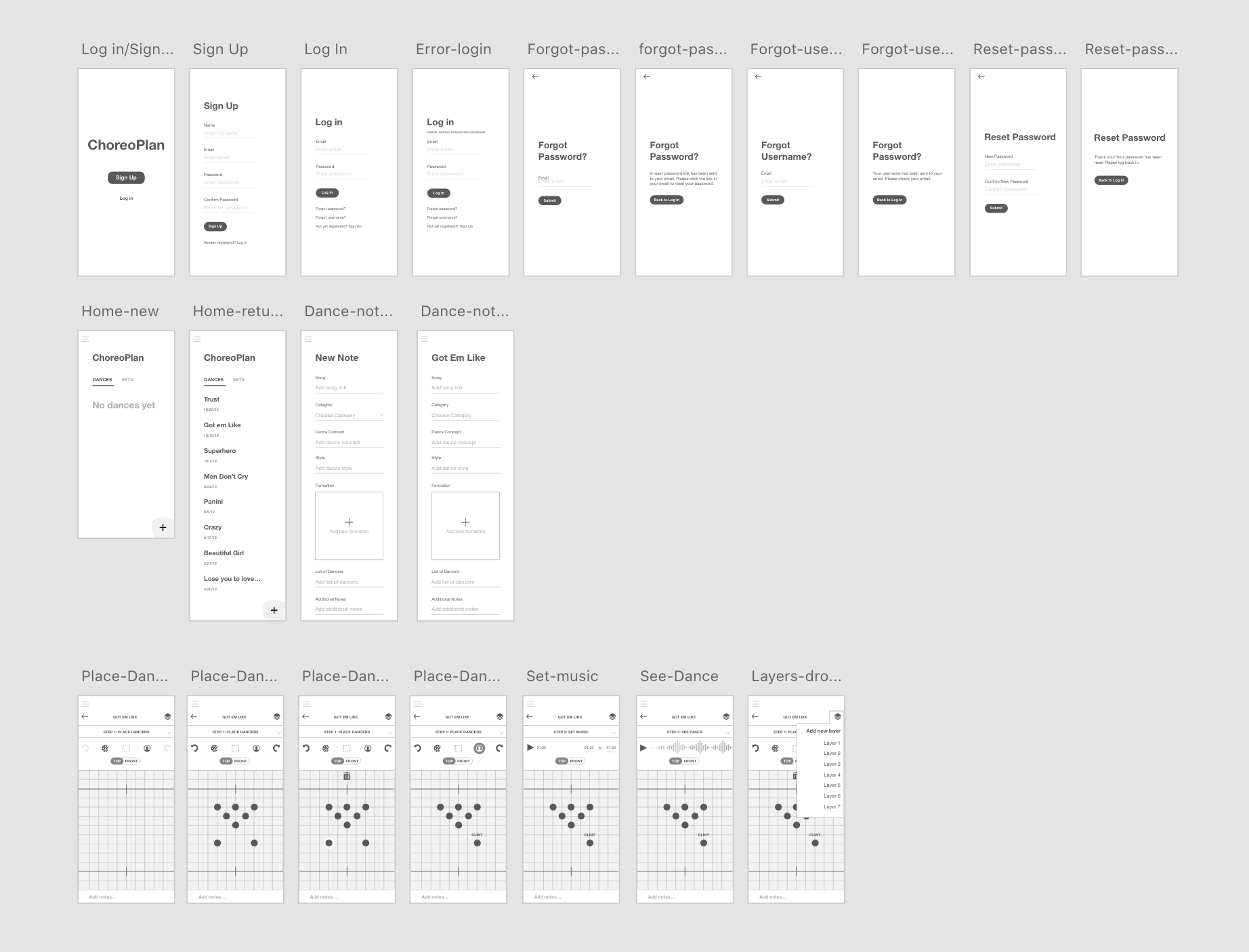
Now that I understand the flow of my users I designed mid-fidelity wireframes to brainstorm how my users will interact with each page of the app.
Meet ChoreoPlan
Putting together my research, information architecture, and moodboard feel, I designed these hi-fidelity wireframes.
Organize dances and sets in one place
To help people have a reference to their ideas, the app doubles as a notebook. It includes custom categorization and set fields to help guide them through the process and especially new dancers. There is also an additional notes field if they want to write something beyond the set fields.
You can also group dances into sets, which are often used for competition or showcases.
Collaborate with others
Based on my data I found that users often not only plan by themselves but with other dancers. I created a feature to allow users to collaborate with others and have shared set lists because often in competitions there are multiple choreographers. This collaboration feature can help users see other's ideas as they plan so that one dance can easily flow to the next.
Create formations and see them with music
An important part of planning any dance is creating the formations to accentuate your moves and ideas. An additional key feature of this app is the ability to create formations and connect the app to a music app to view the formations in time with the music.
Next Steps
After user testing, we found that users would like to see transition movements in between each formation. For the next phase of the app, we will add to the formation maker so that any obstacles during transitions can be prevented.
© Ashley Santiago 2020 designer

