UX Research, Product Design
CSUN Progress
An app for California State University, Northridge students that rethinks the way students register for classes by combining all the different processes to create a better user flow and experience.
DURATION
In Progress
PROJECT TYPE
UX Research
Product Design
TOOLS USED
Adobe XD
Problem
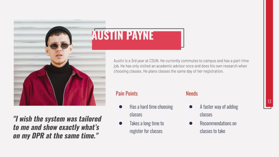
Austin needs a way to find out the classes he needs because he doesn’t have time to visit an advisor.
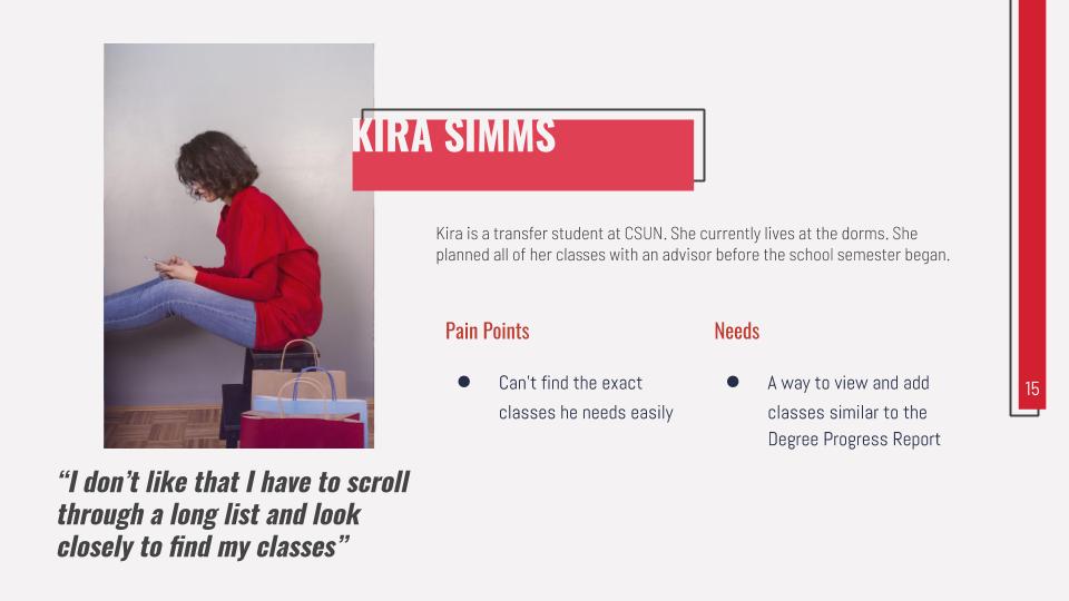
Ryan needs a way to easily find and enroll in classes he planned on taking because he has a hard time finding them.
Hypothesis
We believe that by creating a more understandable and personally tailored class registration system for CSUN students, we will achieve an easier registration process and a better understanding of what classes are needed to graduate. We will know this to be true when we see a drop in students going to an Academic Advisor.
Key Research Findings
To prove my hypothesis, I created a google form with various quantitative questions to help me get a better idea of what issues students may be having and how they register for classes. After over 80 responses from CSUN students, I found the following data:
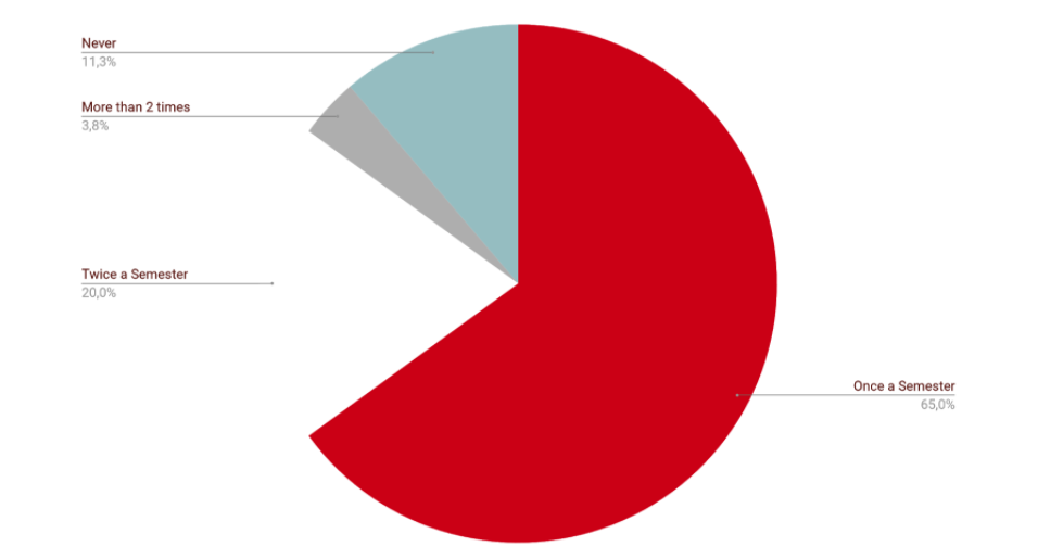
How many times a semester have you visited an academic advisor?
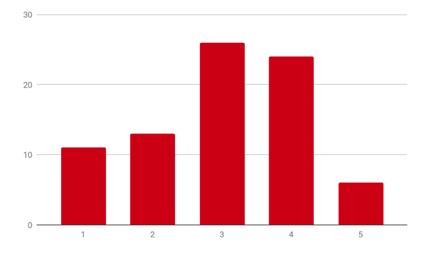
How difficult is it to choose a class to take?
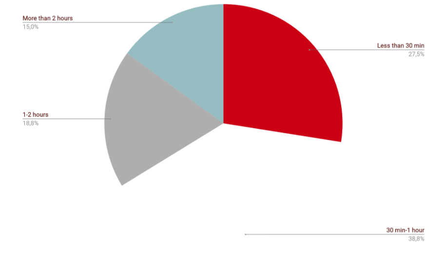
How long does it take in total to enroll in all your classes?
How do you choose what classes to take?
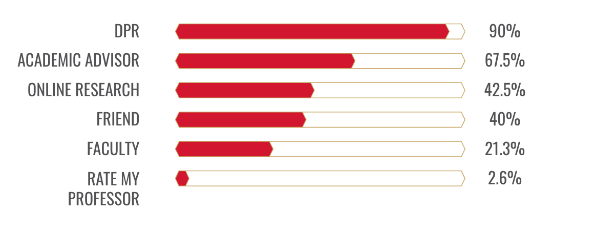
Based on the data above, I was able to see that there was some difficulty in enrolling and choosing a class. At the same time, most people only visited their advisor at least once a semester. An interesting finding was the close percentages on the different ways students choose their classes.
Solution
To combine the different aspects students use to choose classes (Degree Progress Report, Advisor, and Online Research) to create a better user experience when registering for classes at CSUN.
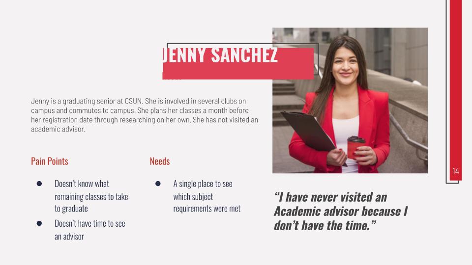
User Personas
Then, I interviewed a few CSUN studnets to learn more about their process and challenges when it comes to registering for classes.
From their responses, I created 3 user personas with the following goals and needs:
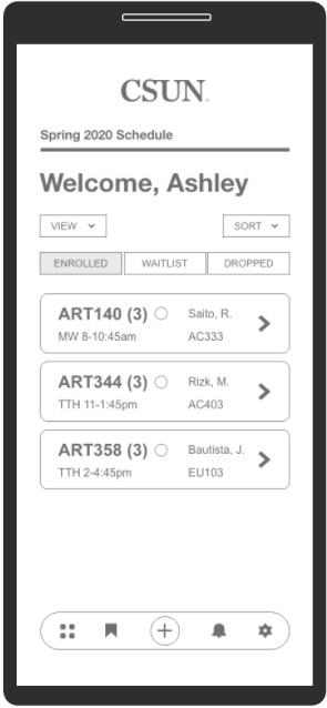
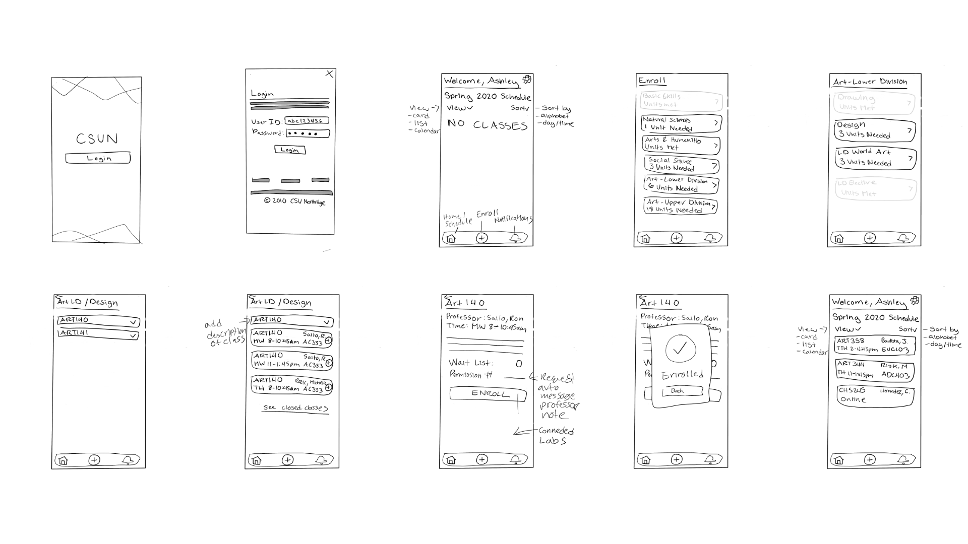
Lo-Fidelity Wireframes
To start my design process, I sketched out low-fidelity wireframes to quickly think about what type of pages I should have.
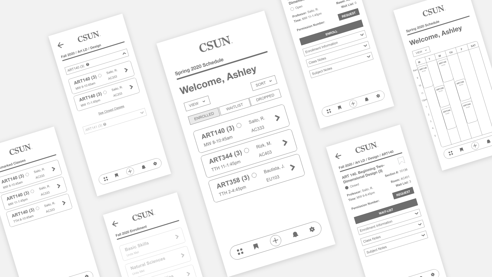
Mid-Fidelity Wireframes
After, I converted my low-fidelity wireframes into mid-fidelity wireframes using adobe xd and carefully planned out each interaction and feature within the app.
What makes this new process different from the current one is that adding classes is based directly from your Degree Progress Report. Since students use it 90% of the time to choose their classes and is utilized by the academic advisor to help guide the student, using this as the model will help eliminate the extra steps.
User Testing
Once my mid-fidelity wireframes were established and prototyped, I did some user testing on 6 students total, 3 students to each task.
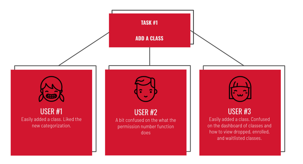
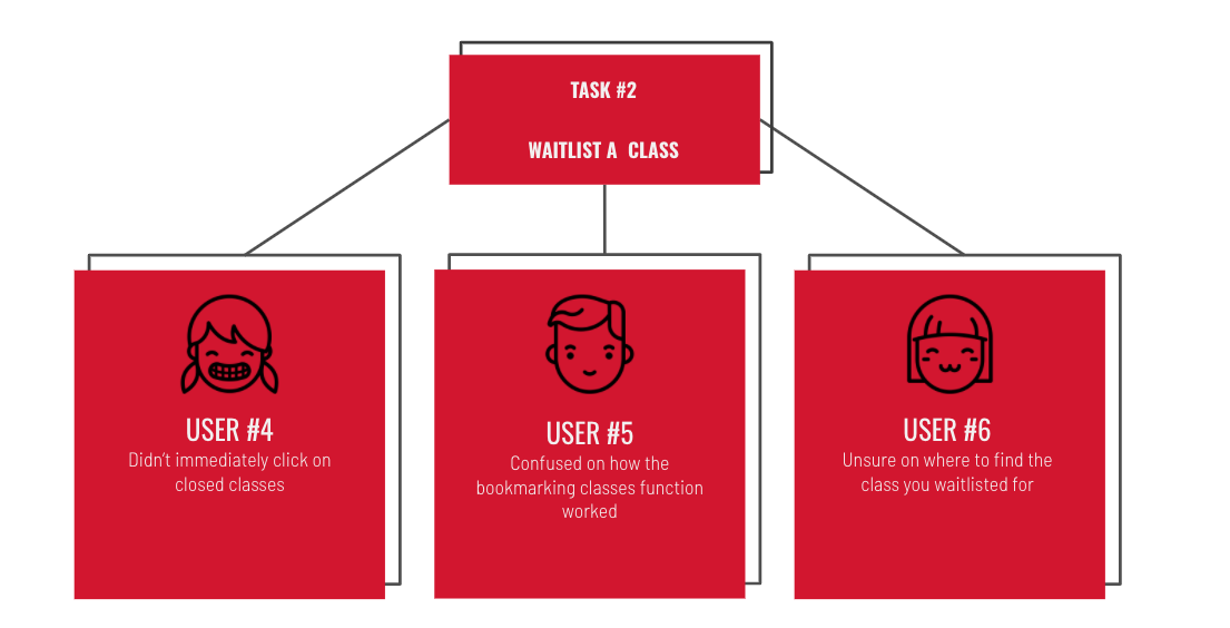
Key Reviews
Some key reviews from user testing:
- “You should sell this to CSUN!”
- “This basically eliminates the need for an advisor"
- “It makes enrolling so much easier”
Next Steps
Solve these issues based on initial user testing:
- Make important action items clearer
- Have more info buttons to let the user what each item means
- Create faster navigation without having to go back a lot
After solving these issues, I would have another round of User Testing and then move on to hi-fidelity wireframes.

© Ashley Santiago 2020 designer