UX Research, Product Design
Jollibee Mobile App
A mobile ordering app for Jollibee customers to efficiently and quickly order from anywhere, anytime for a contactless and speedy service. Rather than have customers order from multiple different 3rd party apps this is a dedicated app straight from the source with the Jollibee experience they expect.
DURATION
2 months
PROJECT TYPE
UX Research
Product Design
TOOLS USED
Figma
Project Overview
This project was created as part of Google's UX Design Certificate program. For this project, I decided to create a mobile ordering app for my favorite filipino fast food restaurant Jollibee starting with a simple user flow of ordering through a dedicated Jollibee app.
Project Role: UX Designer
Responsibilities: Conducting User Research, Designing and Prototyping Wireframes
Hypothesis
We believe that by creating a straightforward, intuitive mobile ordering app for Jollibee, we will achieve a quicker ordering process and the ability to order from any location. We will know this to be true when we see an increase in mobile orders.
Getting to know users
For my initial research phase I wanted to learn about user's experience ordering at Jollibee, so I conducted user interviews with 5 participants. Here are some key quotes:
"Generally now because of COVID they can’t have more than 3 or 4 people in the space. It’s confusing who’s ordering or waiting."
"I think the only problem I had was knowing what to get."
"It’s hard to order sometimes because whenever it’s really crowded you have to constantly repeat your order because sometimes you can’t hear what they’re saying or what you’re saying."
Problem Statements
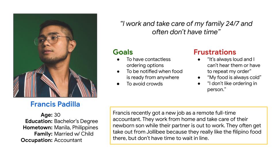
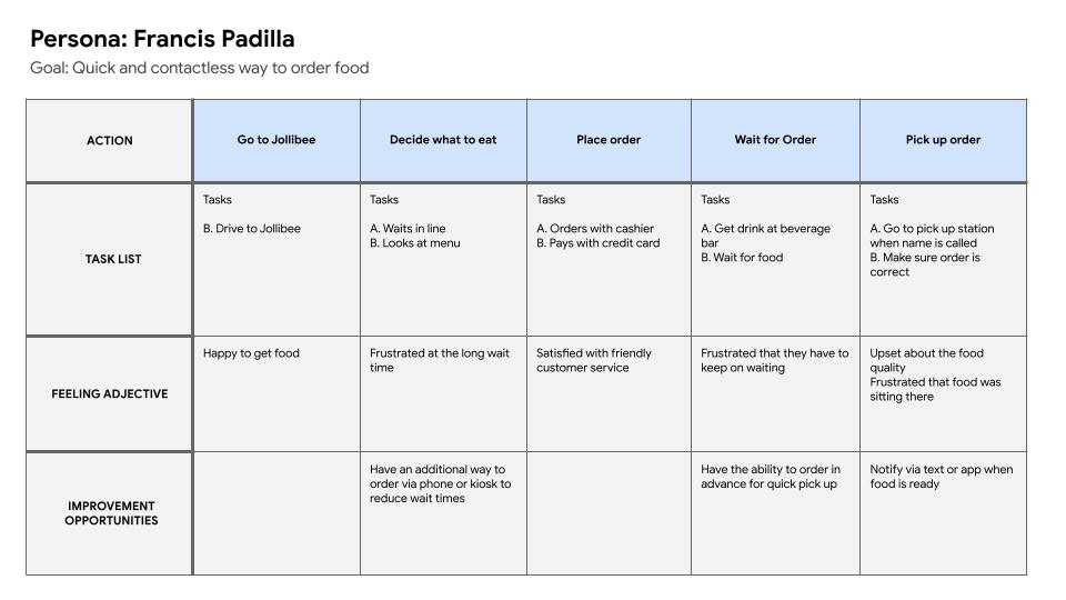
Enrico is a busy father who needs a quick, contactless way to order food from Jollibee because he wants to avoid crows and get back home to his children quickly.
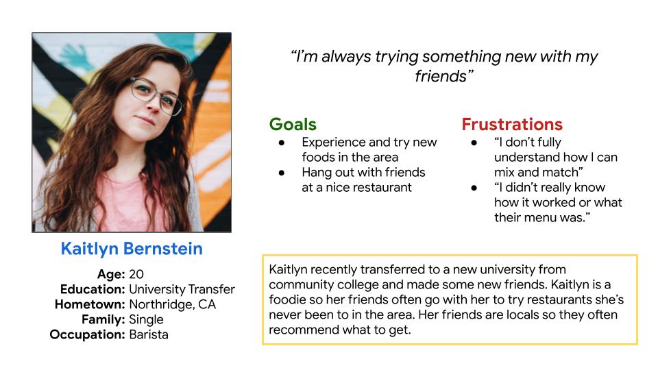
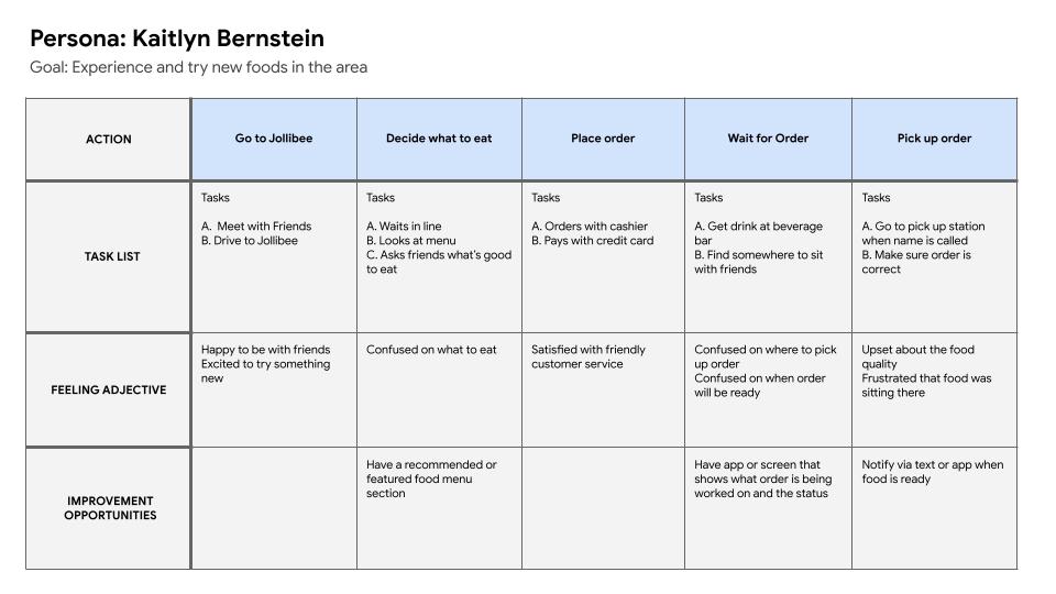
Kaitlyn is a student who is new in town and needs a way to get recommendations on food to eat at Jollibee because she wants to try new foods and doesn't know where to start.
Lo-Fidelity Wireframes
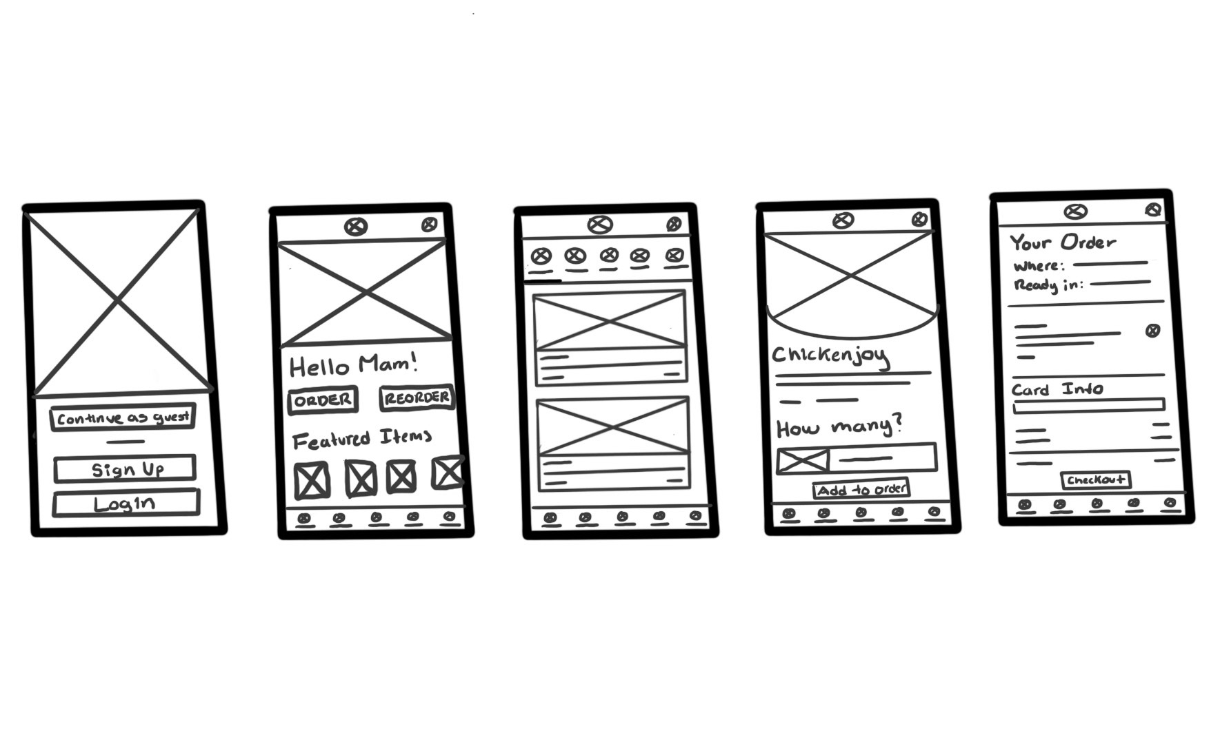
Now that I have empathized, defined, and ideated, I began the design process by sketching out some ideas on the app layout based on my persona goals and knowledge of Jollibee using Procreate.
Digital Lo-Fidelity Wireframes & Prototype
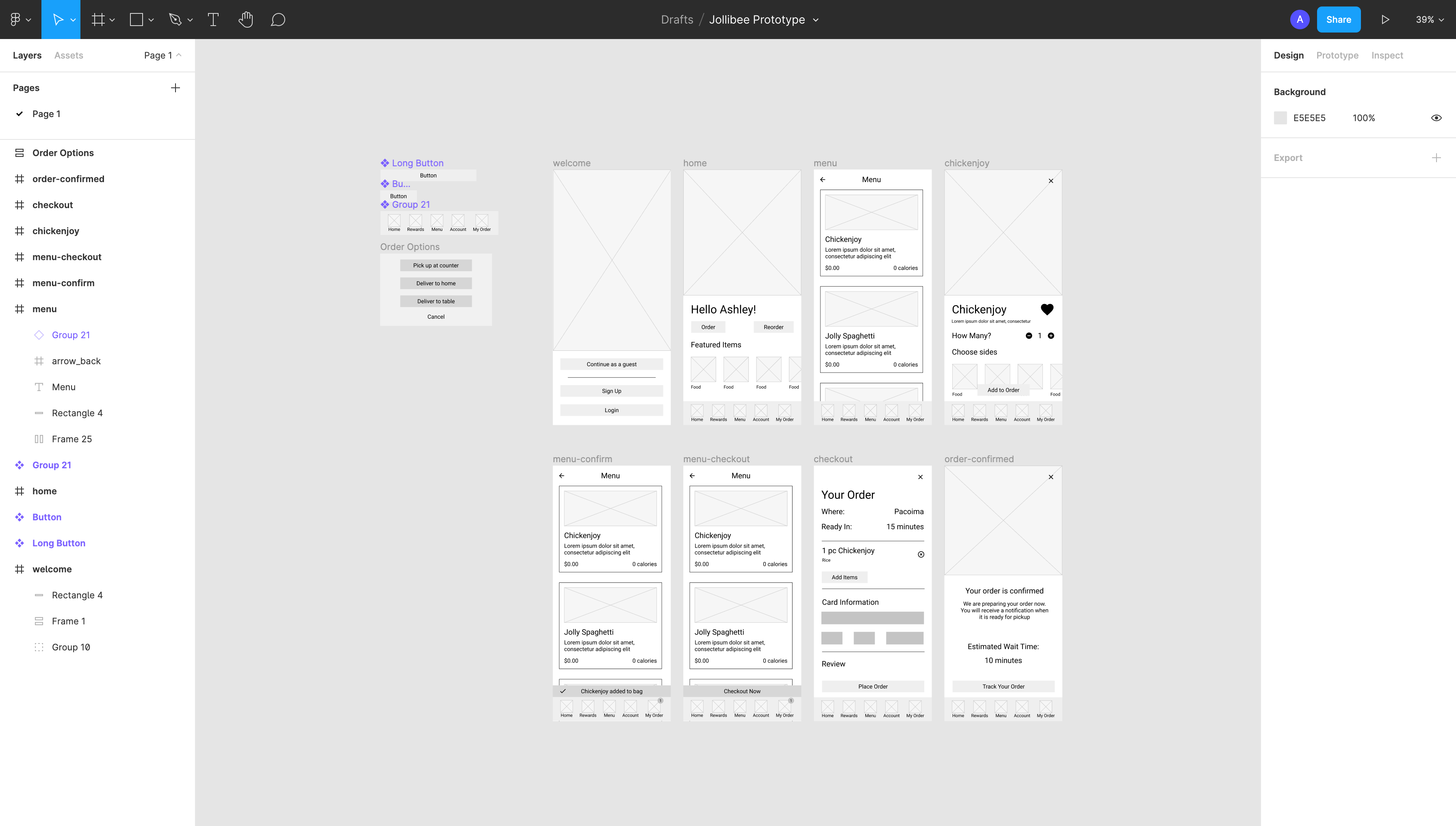
From my lo-fidelity sketches, I used Figma to convert them into Digital Lo-Fidelity Wireframes, then added interactivity to the components to create a a digital lo-fidelity prototype.
Usability Testing
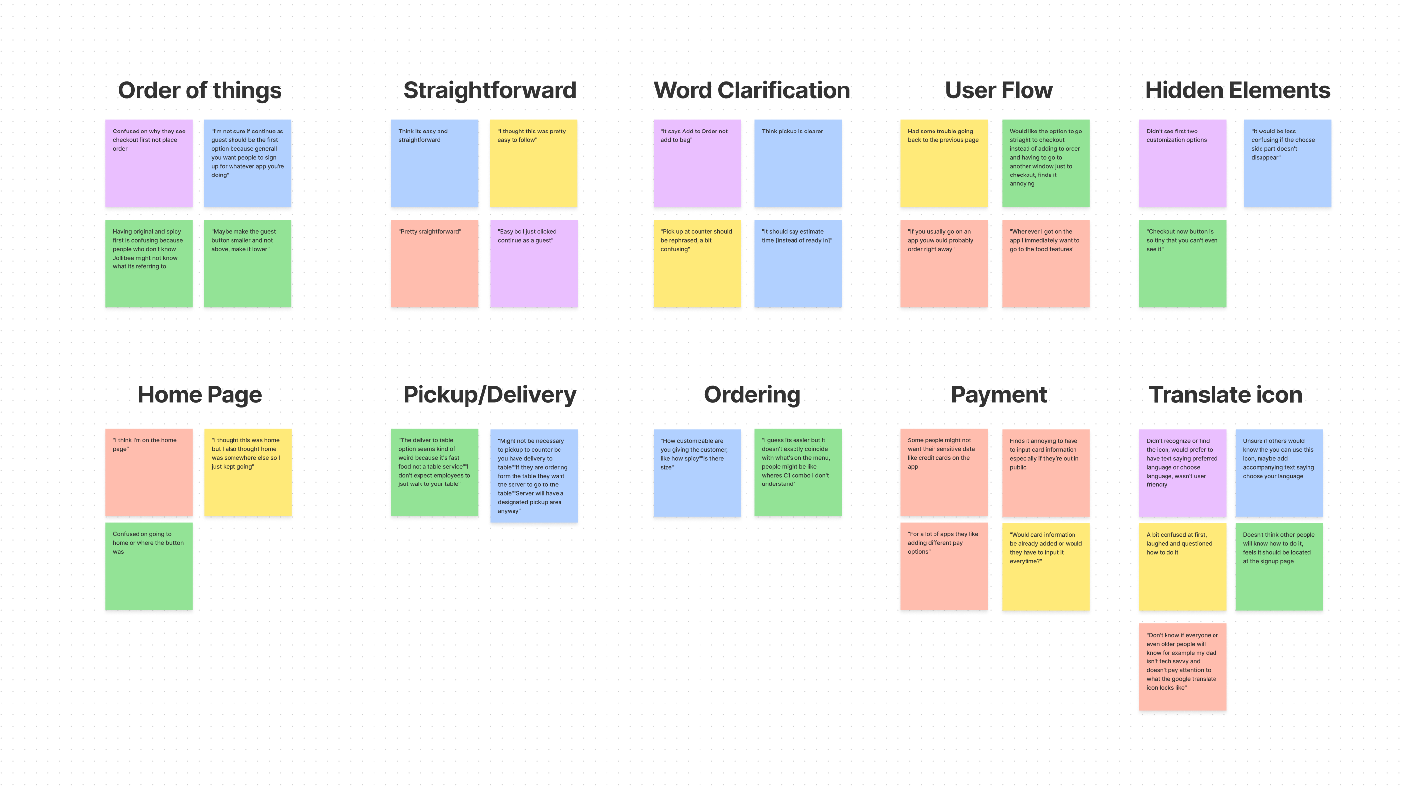
Once my first lo-fidelity prototype was created, I began the first phase of testing. I created a research plan with details of my research, goals, and my script. After, I took detailed notes and sythesized the data into an affinity diagram with various themes using Figma's collaborative whiteboard Figjam.
Key Usability Test Insights
Some key insights from user testing:
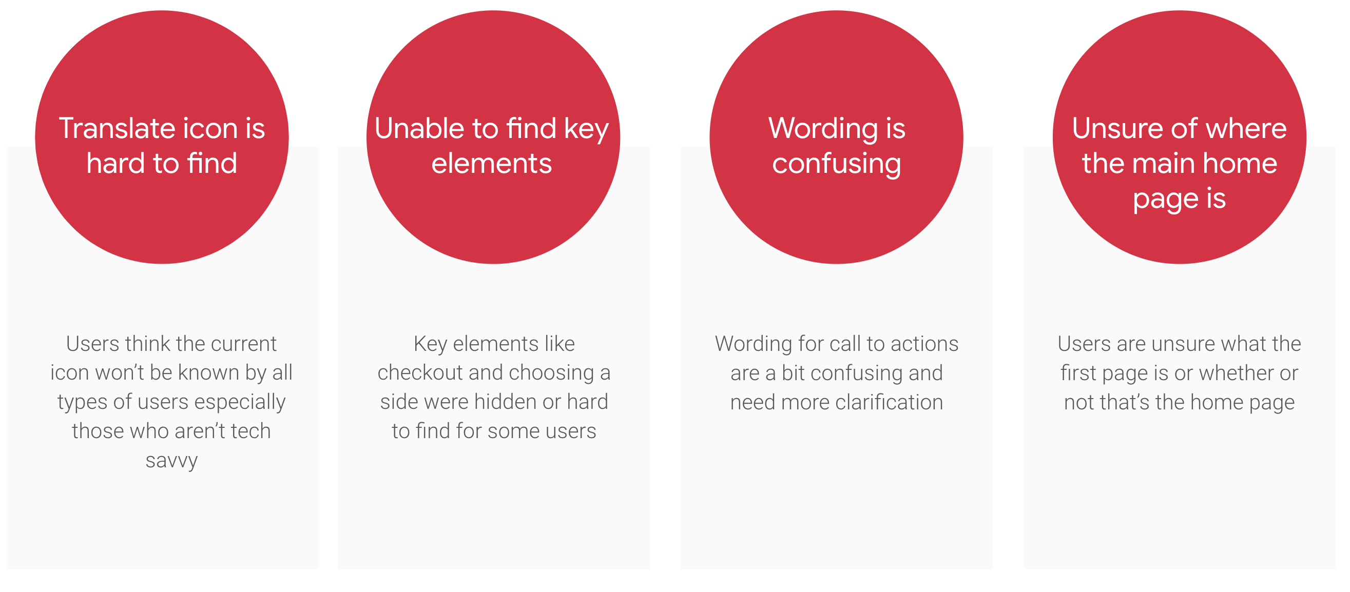
- 5 out of 5 participants didn’t think it was clear enough
- 3 out of 5 participants were unable to find side options or checkout
- 3 out of 5 participants were unsure if the wording of certain call to actions
- 3 out of 5 participants were unsure of whether or not they were on the home page
Revised lo-Fidelity wireframes
Based on the feedback I revised my lo-fidelity wireframes. See before and after below.


Hi-Fidelity Prototype
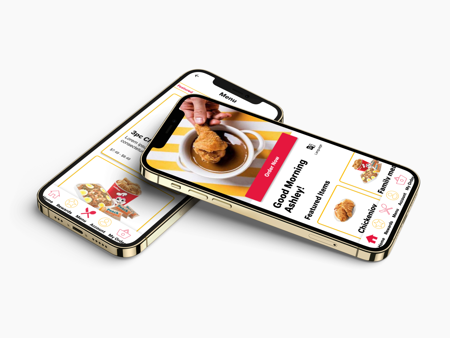
After the lo-fidelity wireframes were finalized, I moved onto hi-fidelity wireframes and prototypes. This hi-fidelity prototype was designed with Jollibee's brand in mind and with user's in mind.
I also wanted to ensure that the prototype met accessibility standards by ensuring text was large enough to read, there was sufficient contrast between colors and elements, and adding a change language feature for users who doesn't have English as their first language.
Click through the hi-fidelity prototype below or select the button below to view it in a new window.
Takeaways and Next Steps
My next steps would be to go beyond this first user flow and design and prototype additional screens for the app. The next flow I am thinking of is the rewards aspect of the app and how to encourage the user to come back and keep using the app. I also want to try and implement additional features for accessibility such as reading text aloud.
© Ashley Santiago 2020 designer

