UI Design, Web Design, Web Development, E-Commerce
Confetē Soirée
& Play
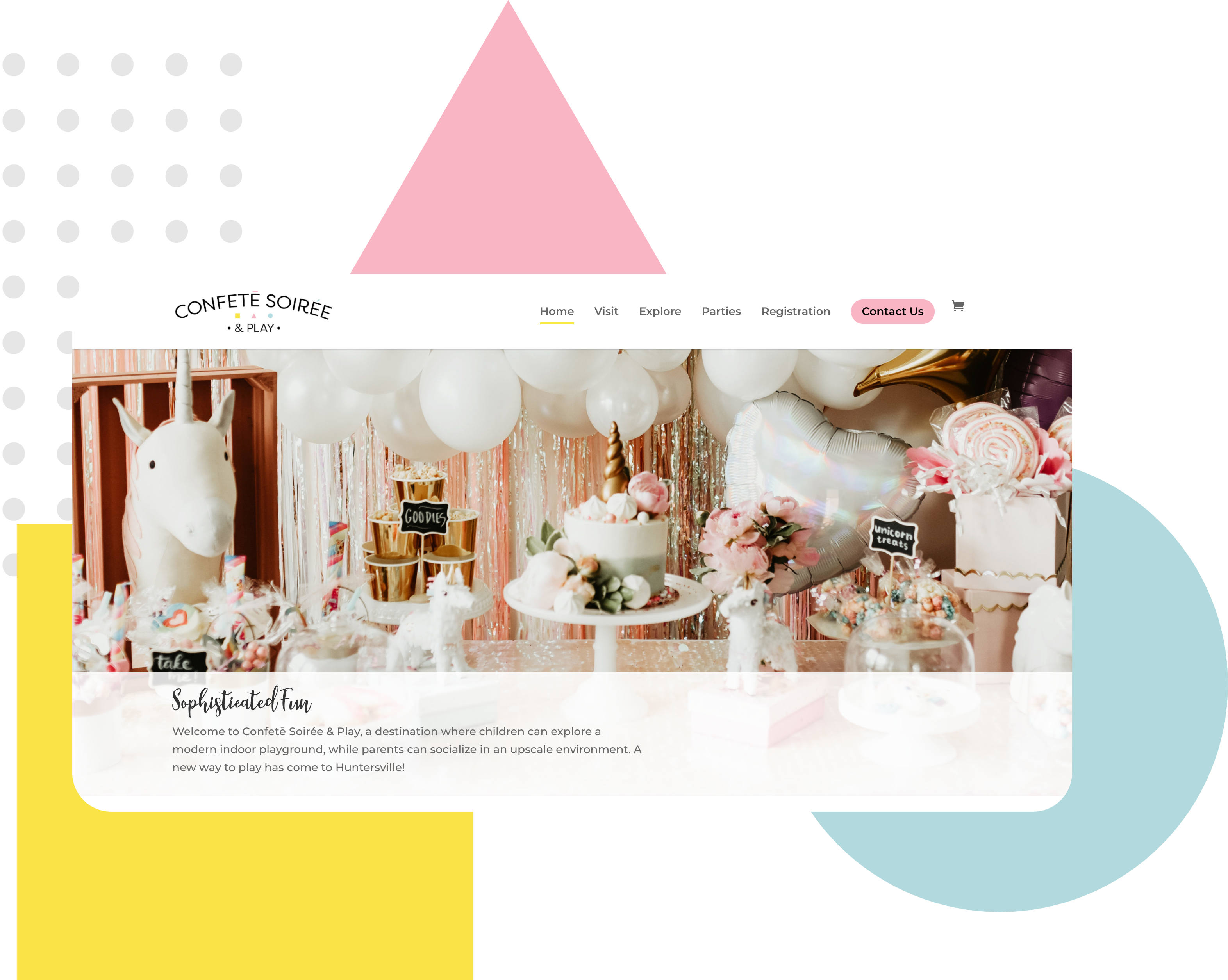
Utilizing branding to design and develop a sophisticated yet fun website for a modern play space located in Huntersville, North Carolina.
TEAM
Melissa Soriano - Project Manager
Kayla Mesina - Design Lead
Ramon Torres - Marketing Lead
Ashley Santiago - Web Designer
Nikki Lao - Visual Designer
Ngoc Tram Tran - Visual Designer
Andila Wijekulasuriya - Visual Designer
TOOLS USED
Adobe XD
WordPress
WooCommerce
PROJECT TYPE
UI Design
Web Design
Web Development
E-Commerce
Overview
Confetē Soirée & Play brings a new type of fun to the city of Huntersville, North Carolina. In this modern play space children can have fun during the day while adults can lounge in style. This project goes over applying its branding to an informational and e-commerce website that will bring families of North Carolina to this sophisticated, fun, and customizable space.
Problem
The owner of the company needed a way to create a brand that will appeal to its specific target audience of sophisticated families in North Carolina and ways to promote their new business.
Solution
Our solution at IntersectLA was to create a brand that represents attributes of sophistication, fun, and customizable as well as create a website to help promote the business and gain customers.
Creating the Sitemap
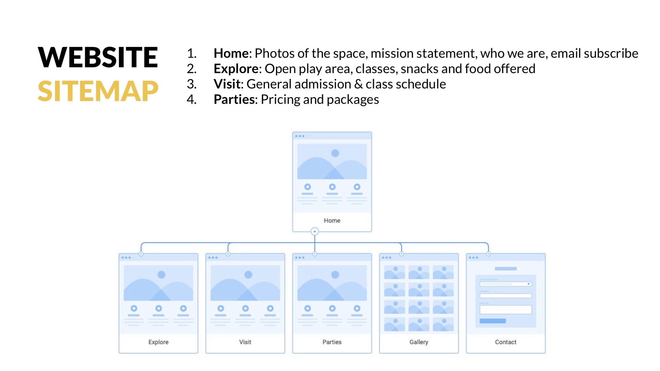
My fellow team members worked with the client to map out what type of content should be on the site and decide key pages. After careful consideration, we created the sitemap below with the following pages and content:
Utilizing the Brand
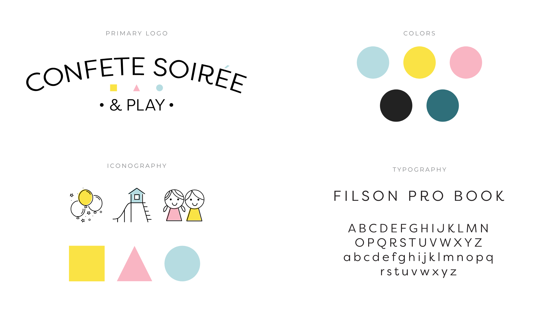
Before I began the design process for the website, I took a look at the established brand guidelines for colors, typography, and graphical elements like iconography that I could use.
Mid-Fidelity Wireframes
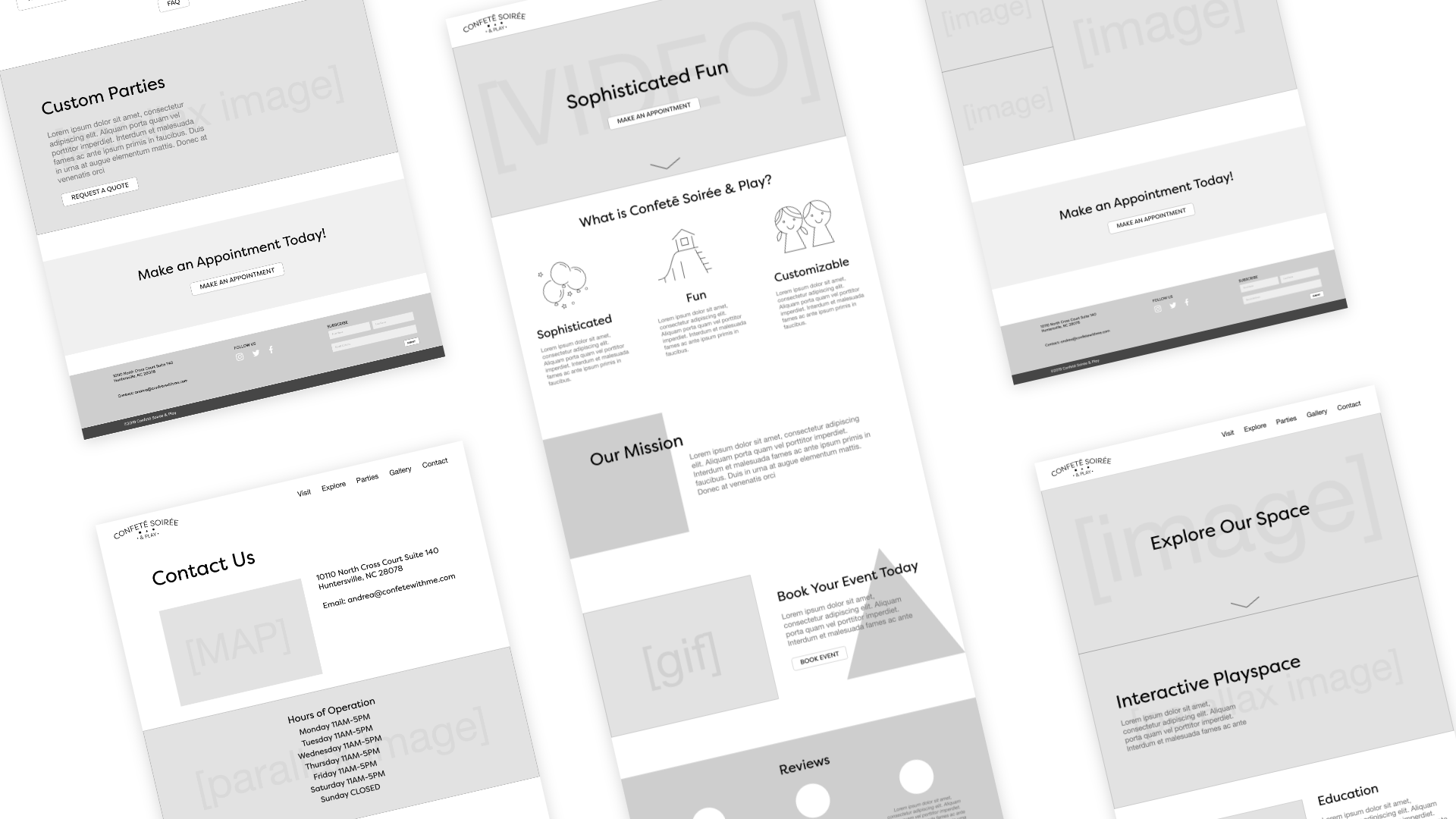
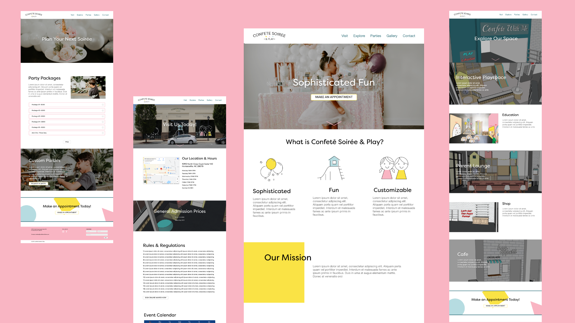
Taking the branding and sitemap content into mind, I designed the mid-fidelity wireframes to establish how the content is displayed and how the user will find information/navigate throughout the site.
Hi-Fidelity Wireframes
Once my mid-fidelity wireframes were established I began adding the UI design, using the brand's imagery, colors, and iconography.
Hi-Fidelity Wireframes (Revised)
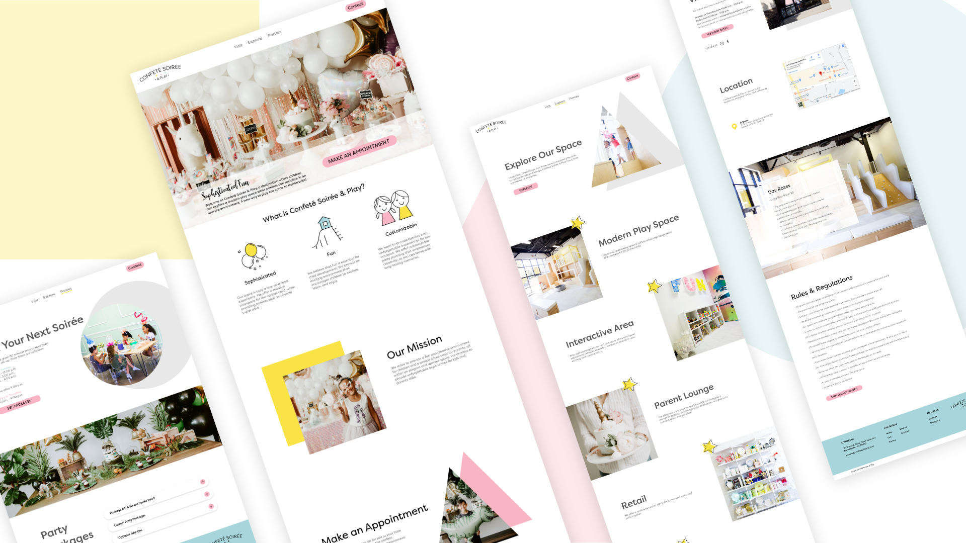
After feedback from fellow colleagues and designers, I decided to revisit the design for the hi-fidelity wireframes. I researched more design inspiration using Dribbble, Behance, and more to view the latest design trends and examples of "sophisticated" website. I also decided not to worry about the limitations of its development.
Use the slider below to see the hi-fidelity before and after.


Key Design Changes
As you can see above there were some key design changes on the home page alone. Changes include:
- Improved Grid Layout
- More Negative Space
- More focus on an engaging hero image with Call to Action to keep users interested the minute they land on the site
- Re-arranging brand's graphics to complement high-resolution images rather than random placement behind the text
Once I redesigned the home page, I was able to apply the same principles to the rest of the pages, using a lot of inspiration.
Development/E-Commerce
After the hi-fidelity wireframes were designed and finalized, I began the development on the site using a CMS, WordPress, and the Divi Theme and Builder. Although there were some limitations, I was able to use my skills in HTML, CSS, and WordPress to develop a site that was as close to my hi-fidelity wireframes as possible.
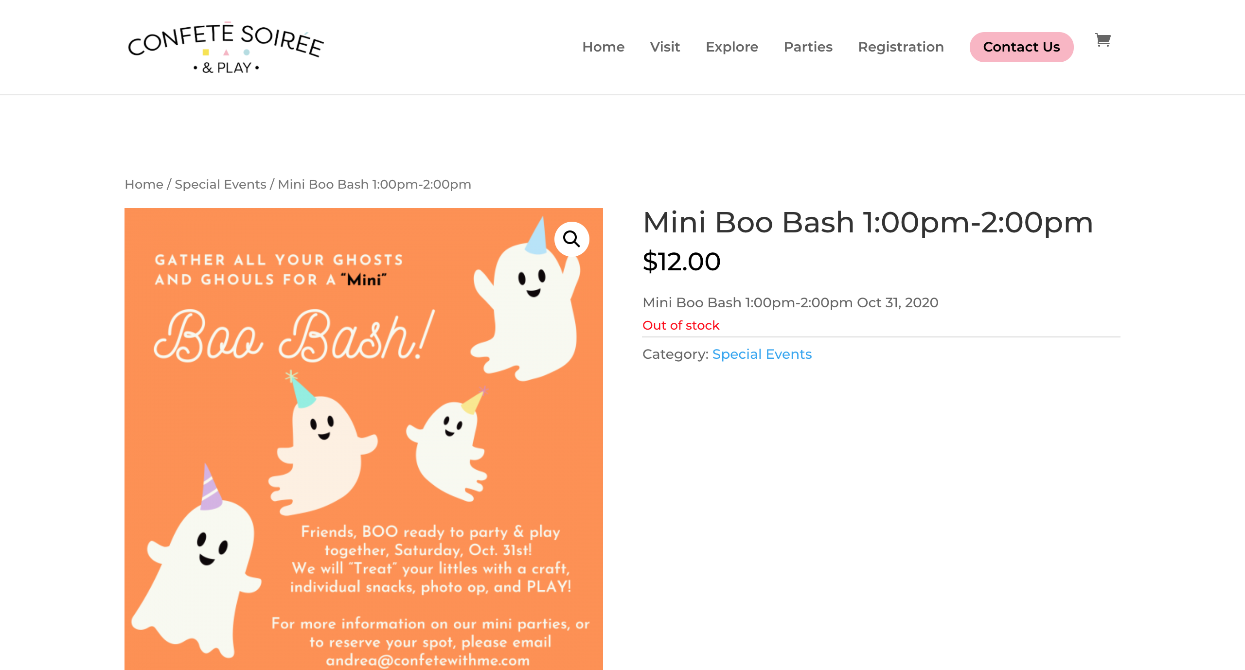
In addition, the client needed a space to have people register and purchase events or items on the website. To create this additional feature on the website, I set up an e-commerce shopping system within their WordPress site using WordPress's WooCommerce plugin. This will allow users to pay directly through their site and let the client be able to easily manage stock and orders.
Results
© Ashley Santiago 2020 designer


