UI, Atomic Design
Jollibee
Design System
Utilizing Atomic Design to create a design system and consistency within Jollibee's multiple regional websites.
DURATION
2 months
PROJECT TYPE
Design System
Web Design
TOOLS USED
Adobe XD
Overview
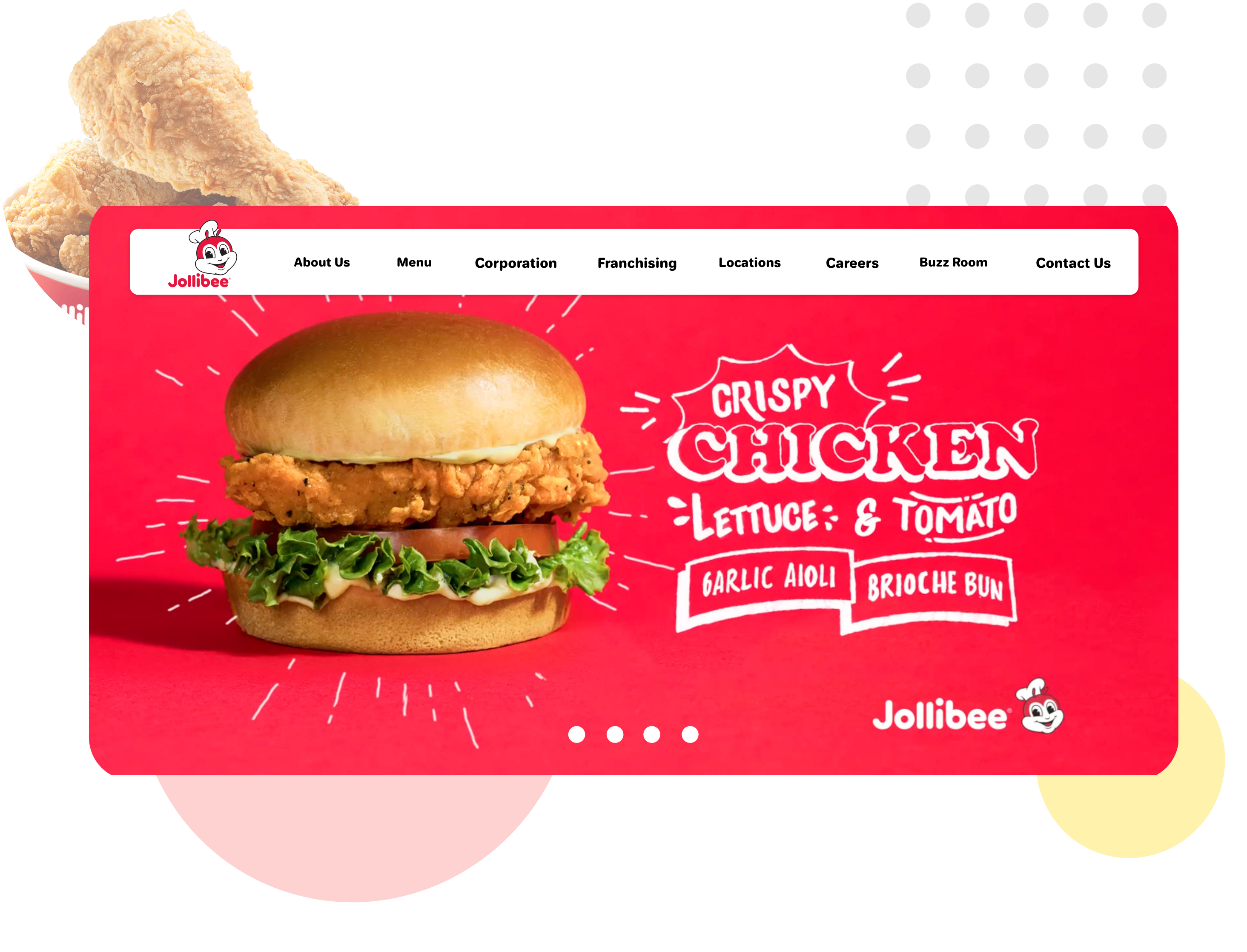
Jollibee is the largest fast-food chain in the Philippines, operating a nationwide network of over 750 stores. This design system concept for Jollibee helps establish a consistent design system across all Jollibee websites.
Problem
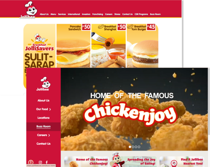
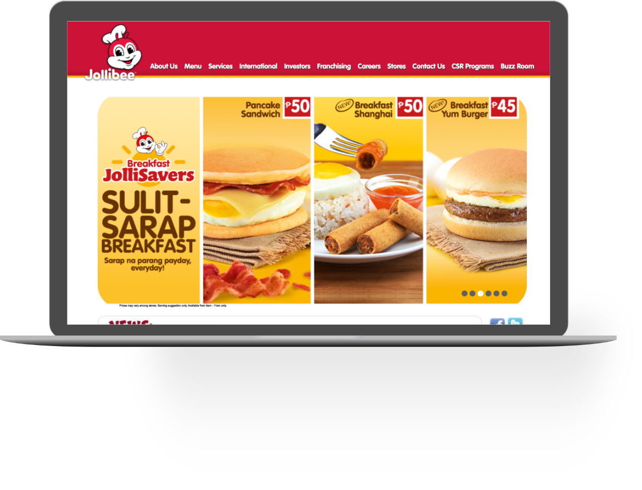
As an international food chain, Jollibee has multiple sites that cater to their specific regions. However, each site is different and doesn’t have a consistent look. Some lack modern UI elements, some have better visuals, and the user experience between all of them is drastically different.
Solution
Instead of doing a redesign of one of their websites, I wanted to create a design system so that no matter what region or who edits the site, there is are basic guidelines and designs to start from. This will ensure some consistency while allowing for each website to cater to its different regions and cultures.
Utilizing Atomic Design
To help establish this design system, I utilized Atomic Design, a design method created by Brad Frost. This method ensures that the design is carefully thought out step by step from the smallest element to the largest element. It also helps make sure that communication from the designer to the developer is smoother and creates consistency for Jollibee’s web presence.

Sitemap
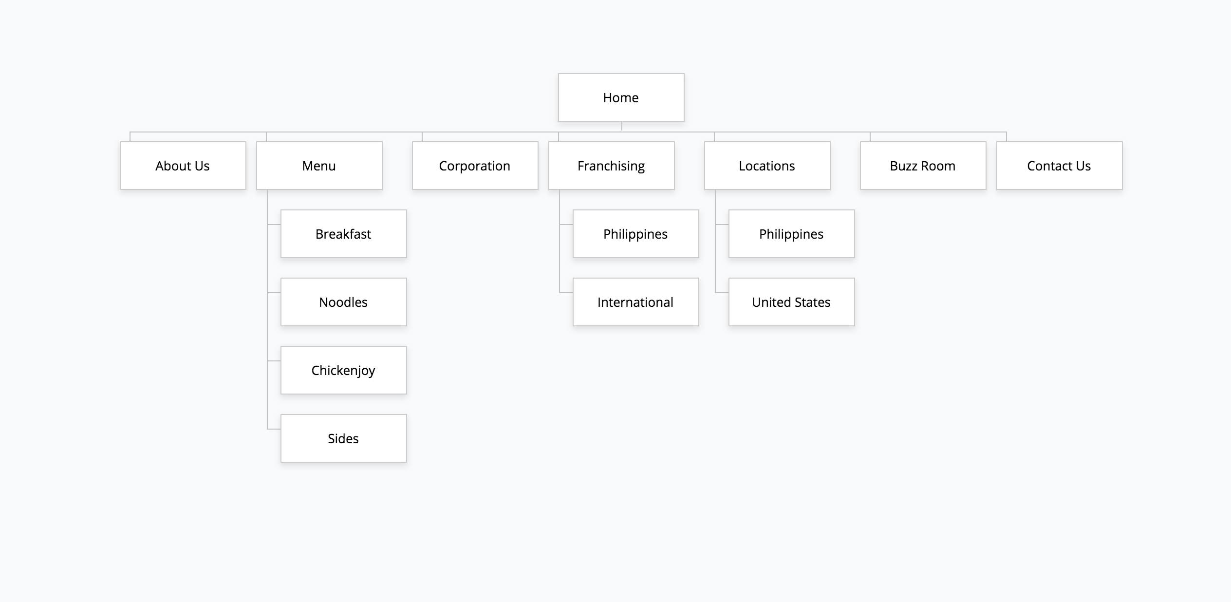
Before I establish a design I took a step back and created a sitemap of how each of the links will be organized. One of the issues in Jollibee sites is that there are too many links and too many links that are broken. I took many of the links and removed any broken ones and made sure to keep key links at the top.
Brainstorming with
Style Tiles
Before designing the atoms, I researched the brand’s missions, goals, and values to create 2 different style tiles. The first style tile had a more fun, welcoming mood, utilizing abstract shapes and their bold red and yellow colors. The second style tile had a more modern look with more negative space and fewer colors, with the main focus on the food, something their current sites lack.
After further research and feedback from my colleagues, the first style tile was chosen as the best option to represent the brand while keeping its values and usual feel.

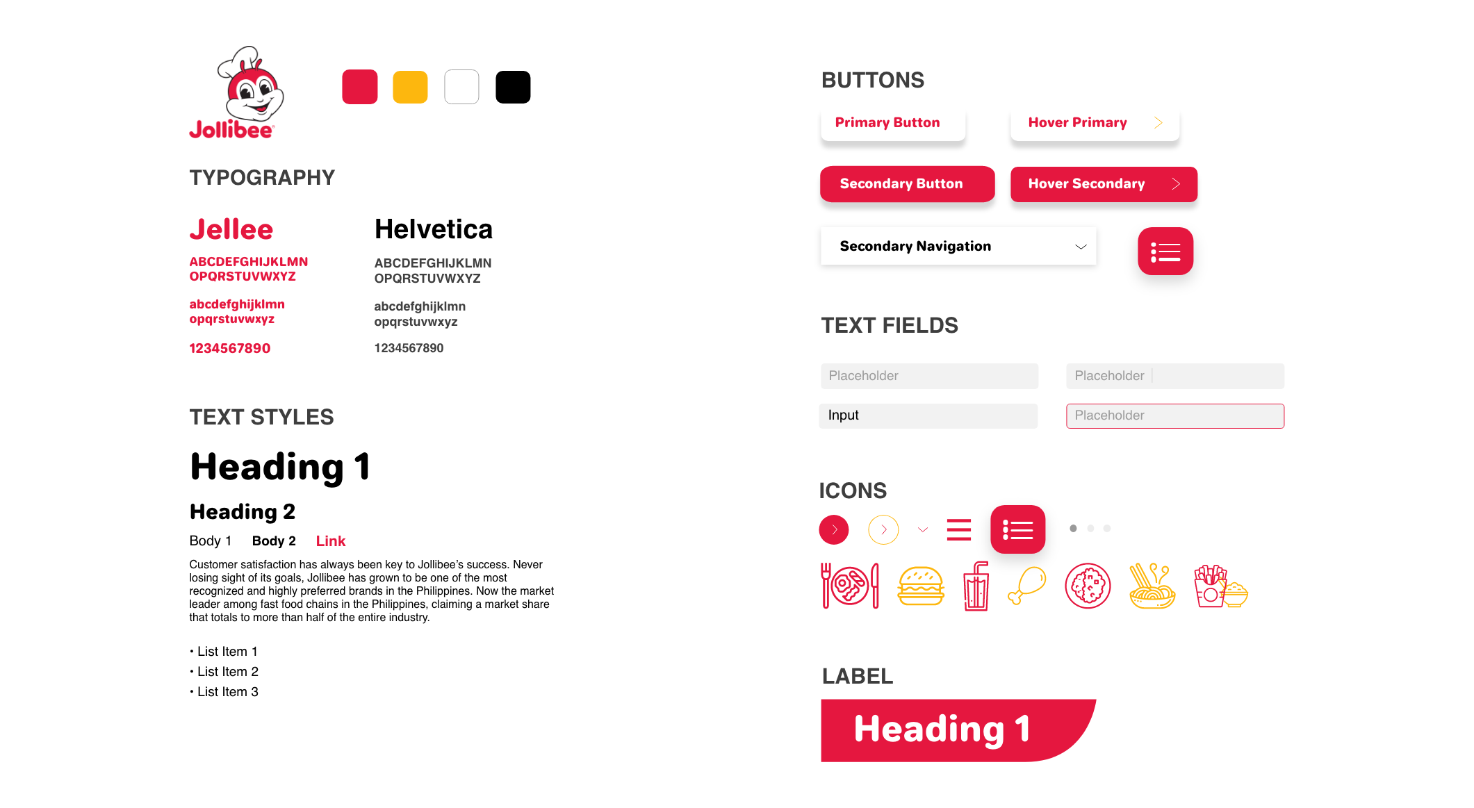
Creating the Atoms
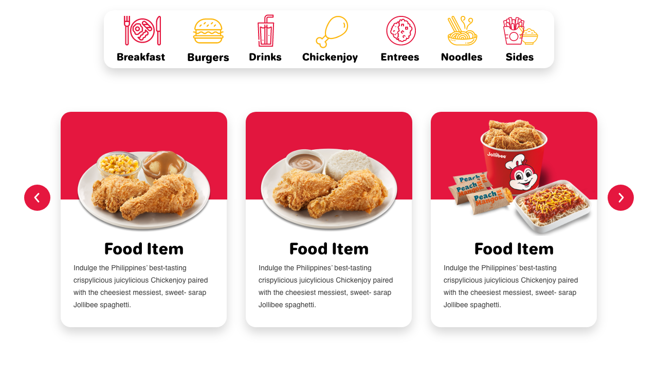
Based on my chosen style tile, I began creating each atom. I used the brand’s colors and fonts but made sure the body copy was a readable, less decorative font and that other graphic elements were more modern with rounded edges, shadows on buttons, etc. The icons were chosen through iconmonstr to help represent the different types of foods that Jollibee offers.
Putting Together
the Molecules
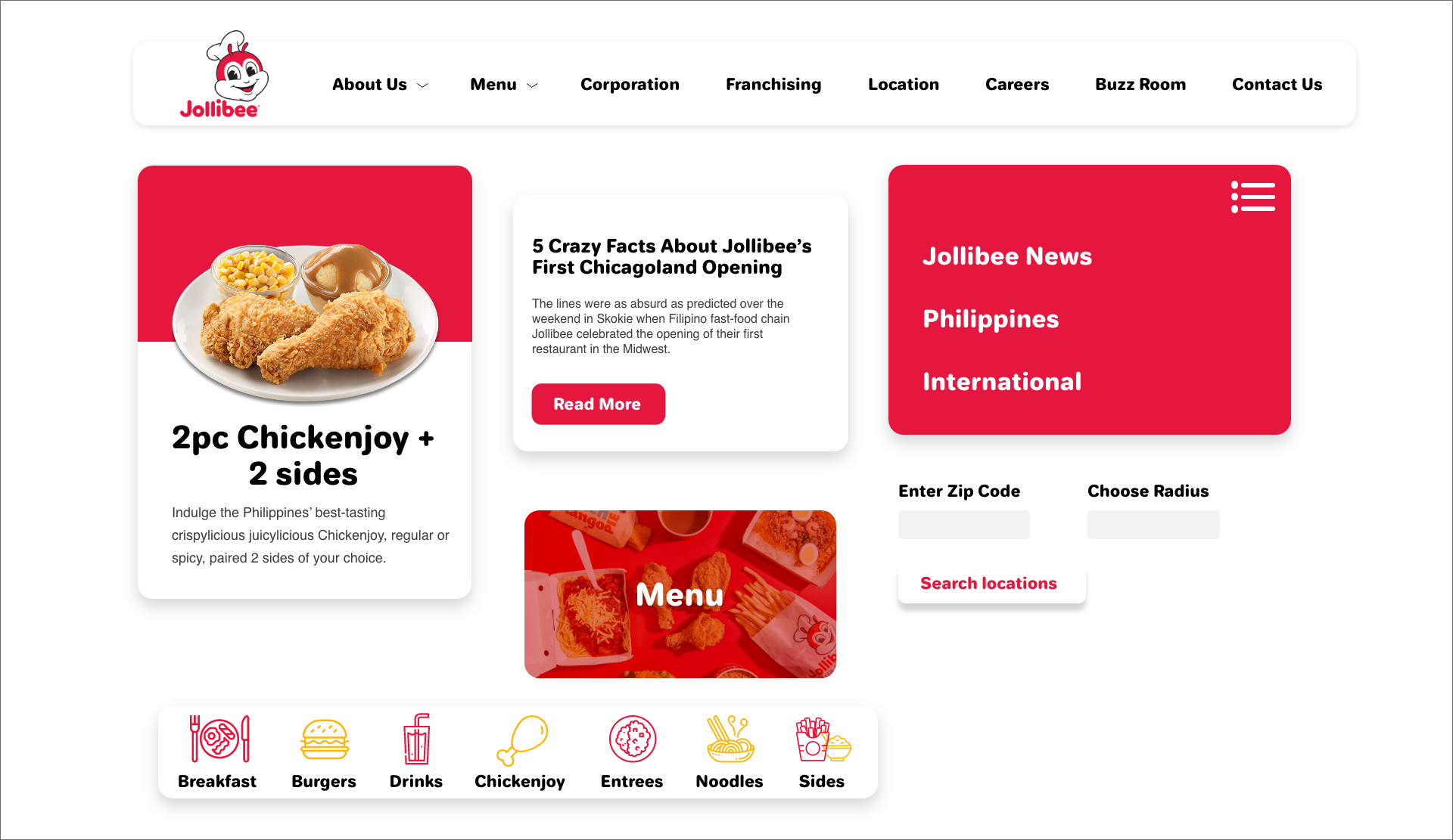
From what I established in the atoms, I put them together to create molecules such as the navigation bar, how text is seen in articles, how buttons and fields are combined, etc.
Grouping Molecules
into Organisms
Templates and Pages
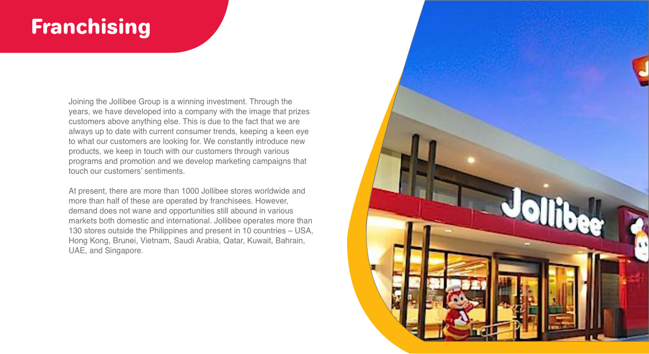
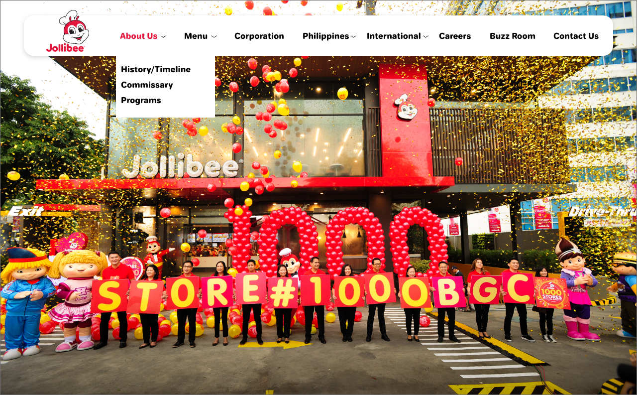
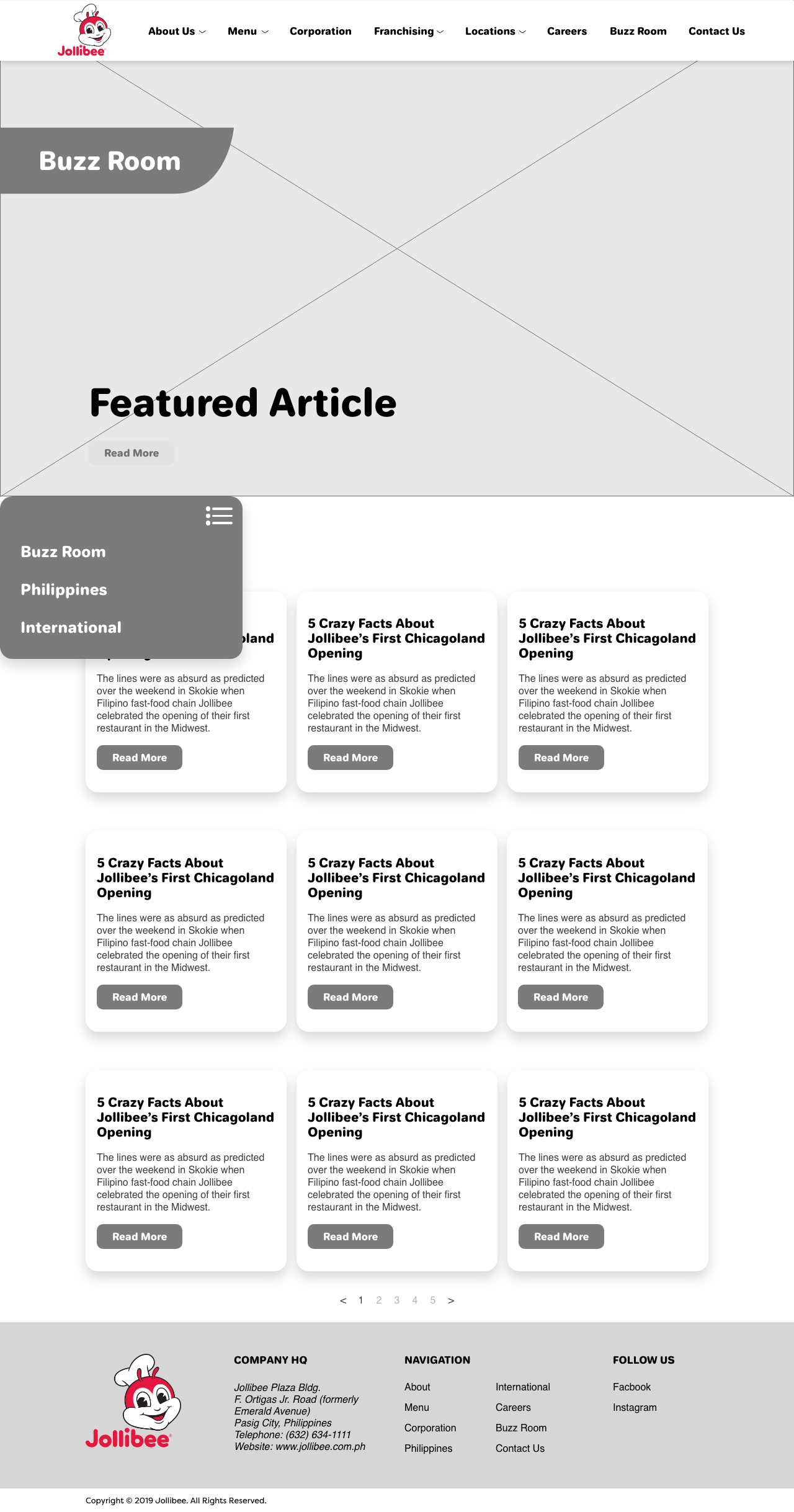
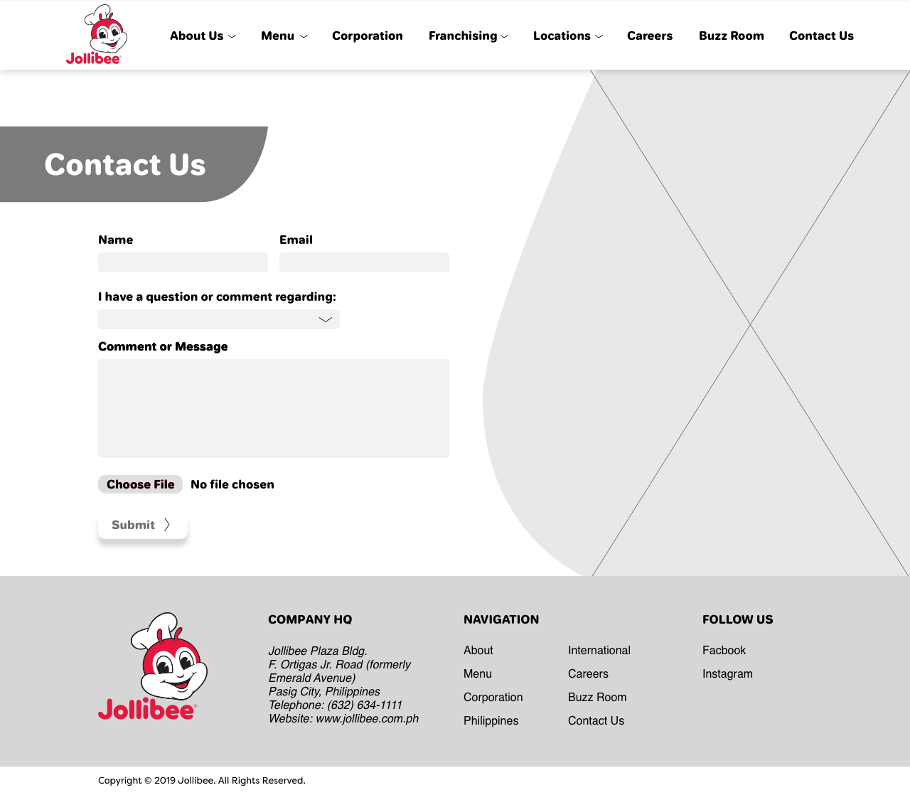
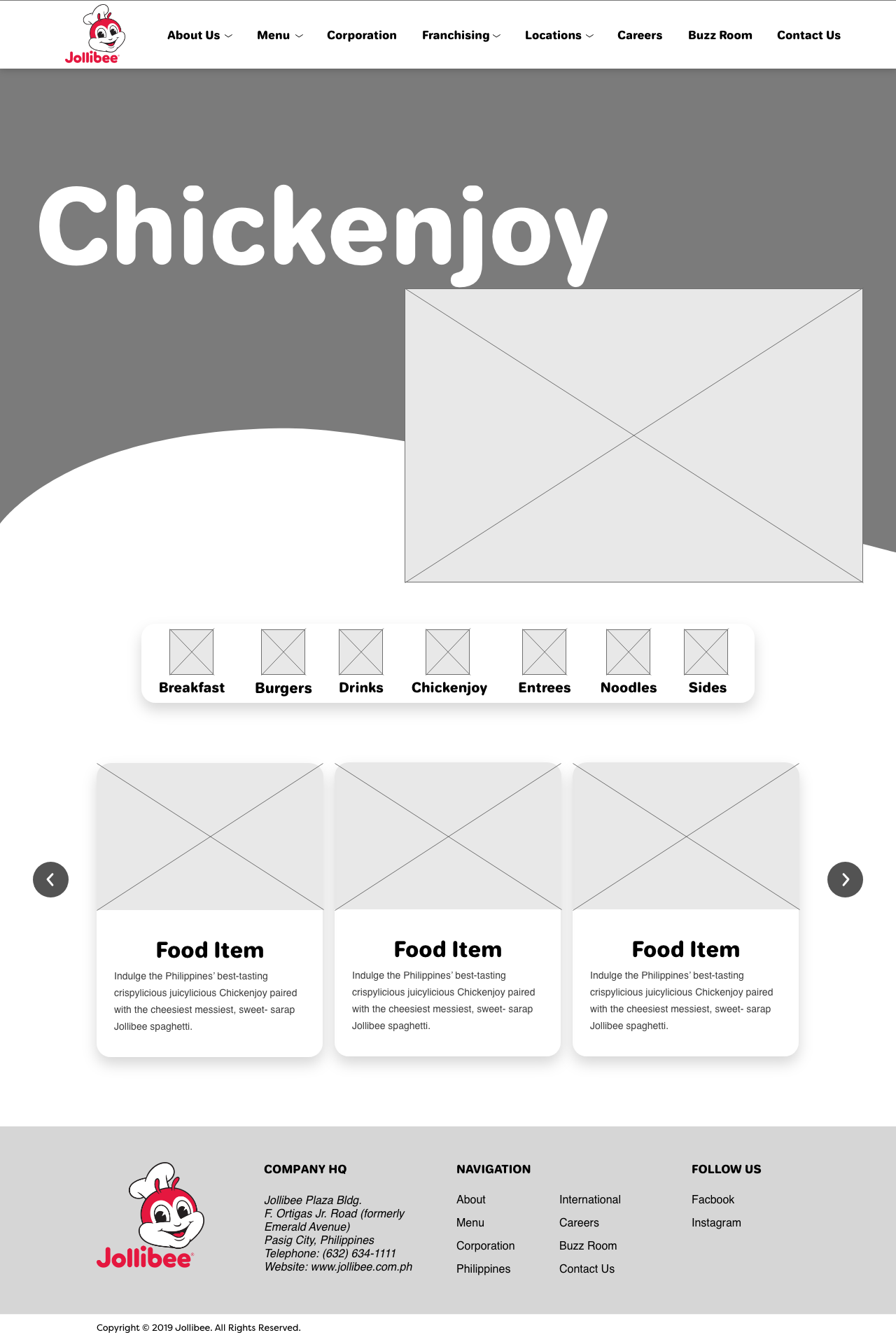
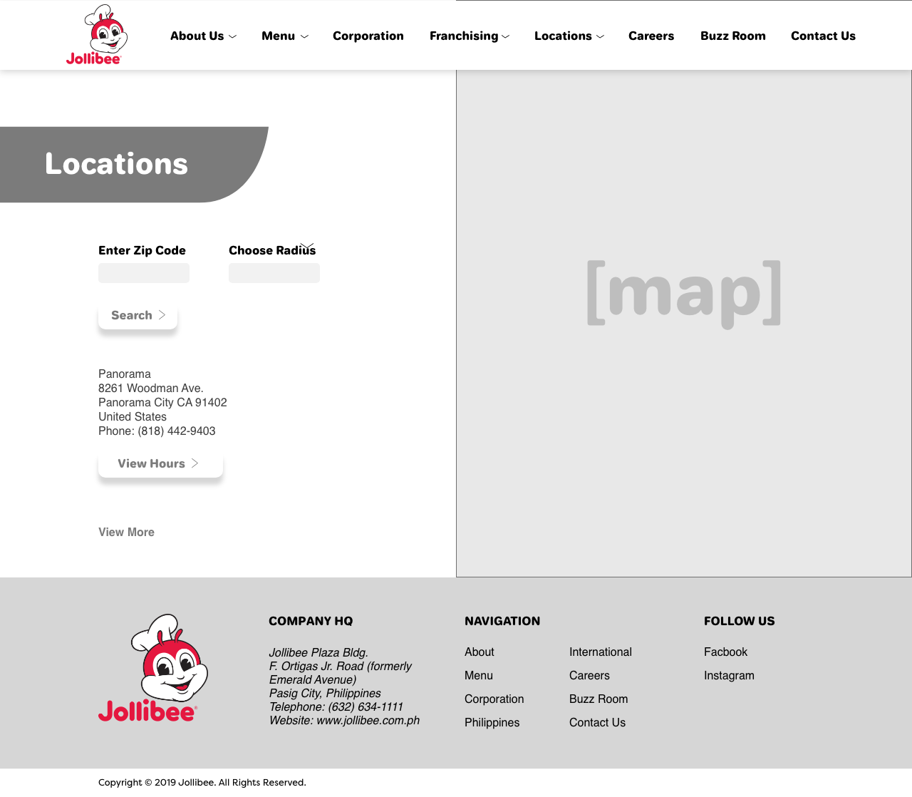
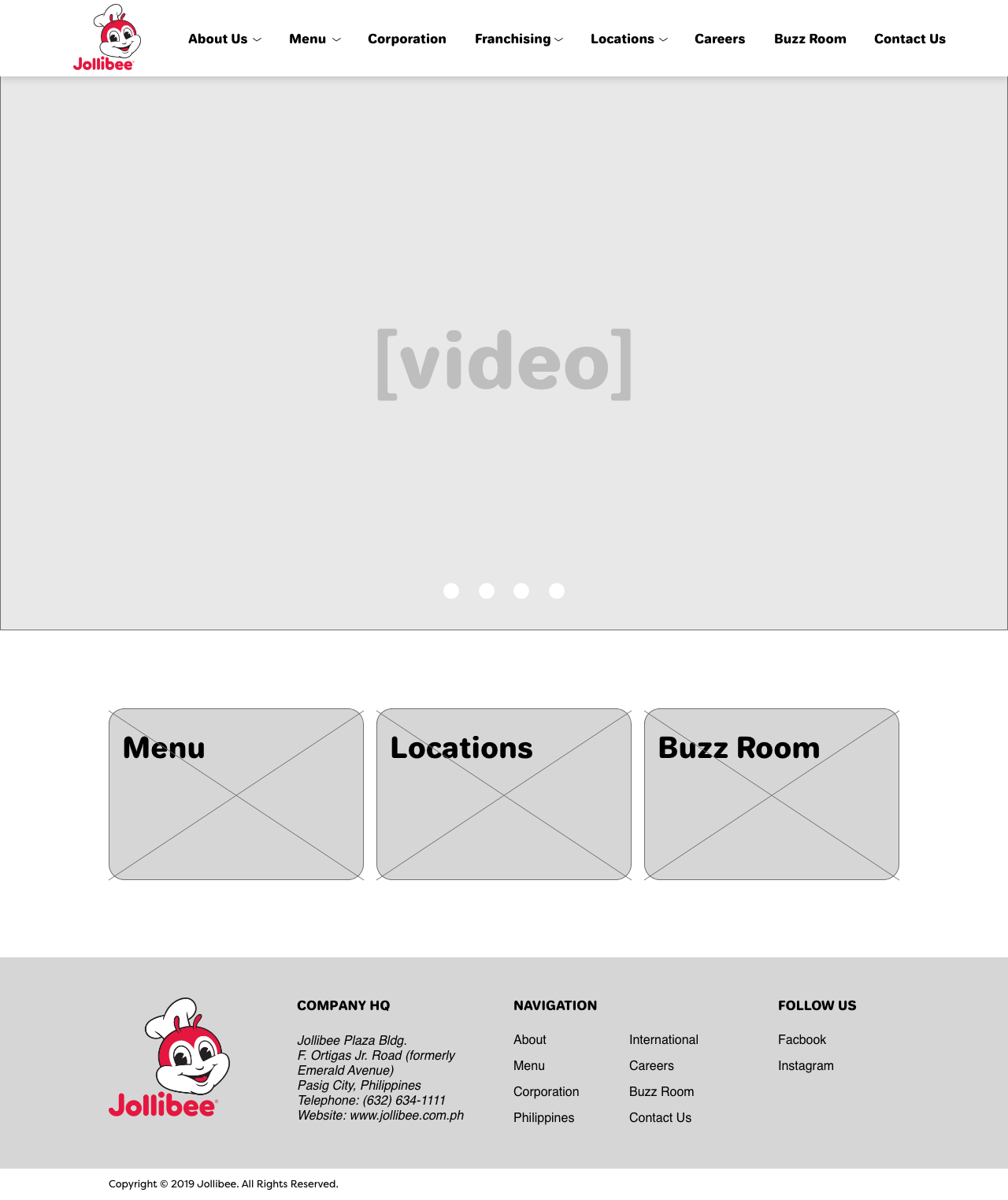
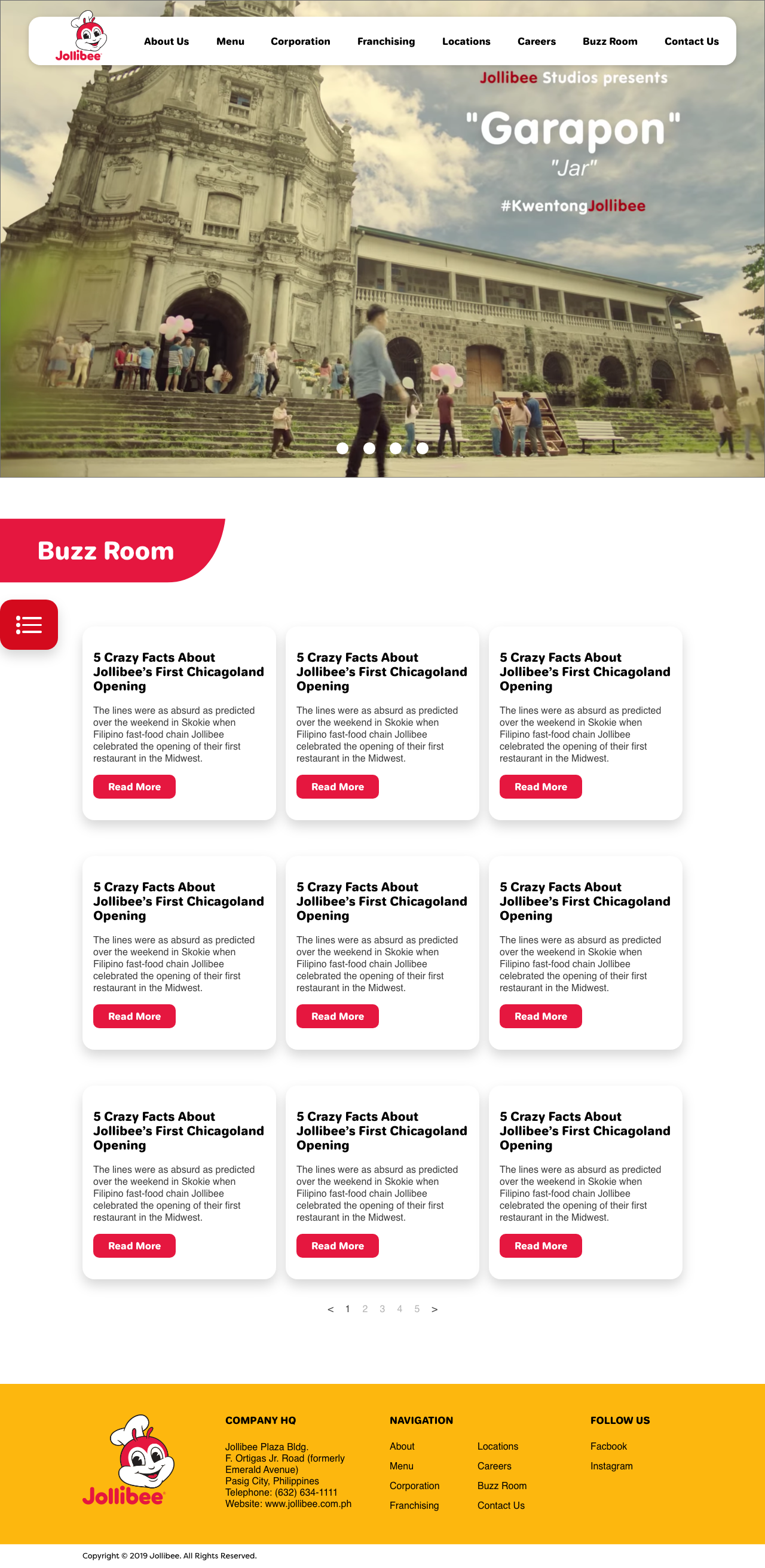
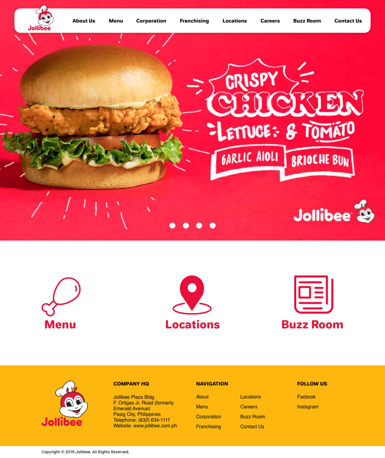
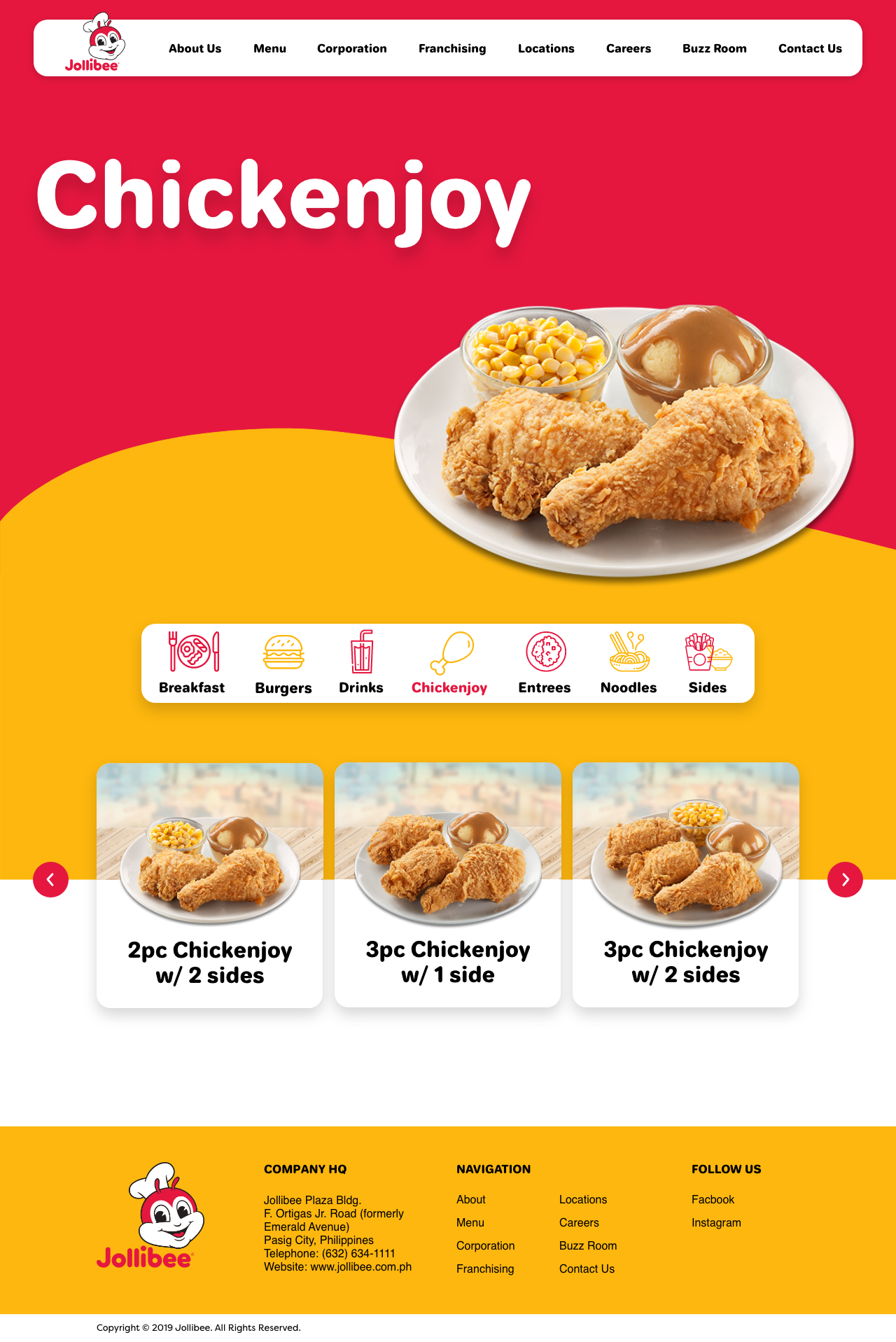
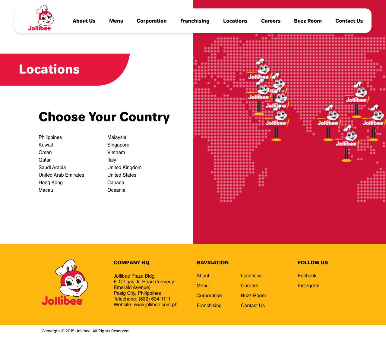
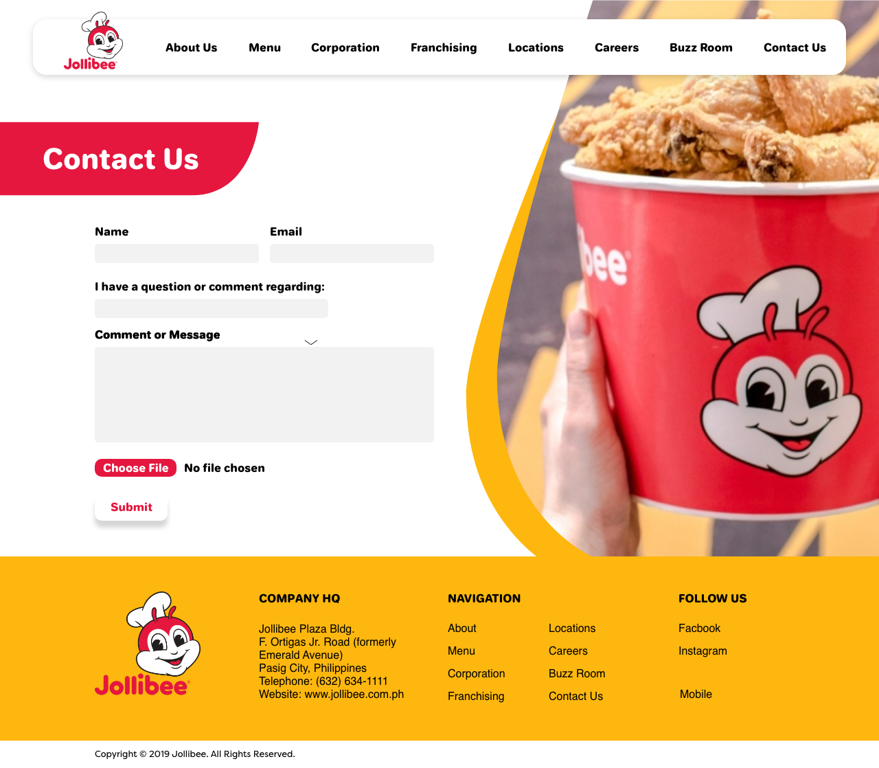
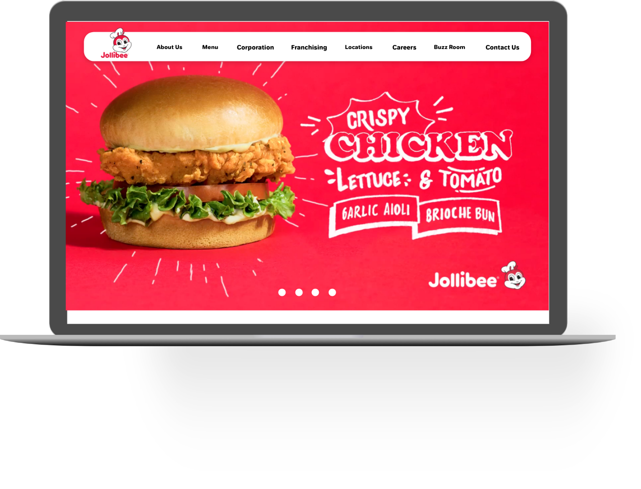
Combining all of the organisms then allowed me to create templates for all of the word heavy pages as well as design all of the other pages in both desktop and mobile view.

Next Steps
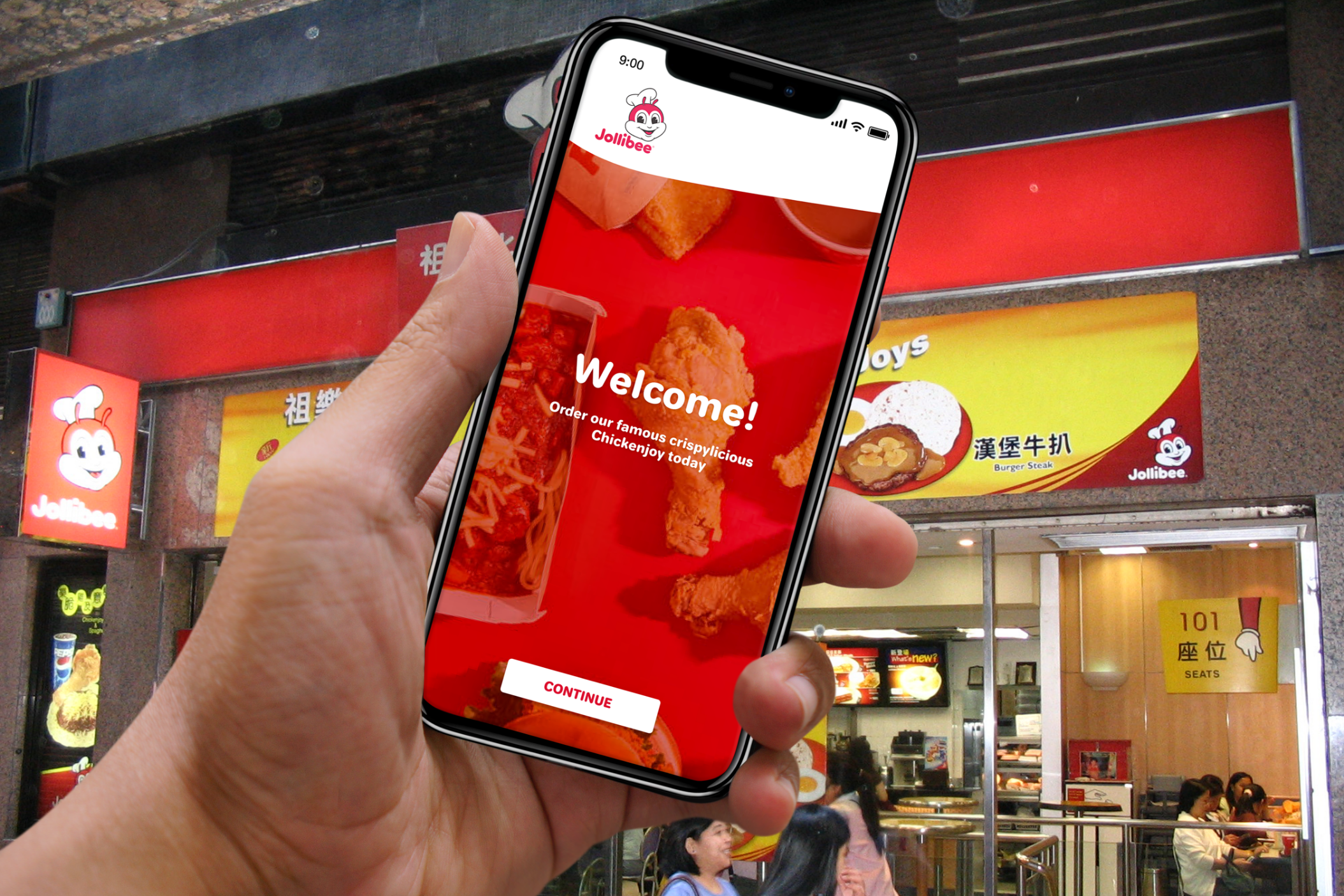
The next step would be to utilize the design system and create a mobile app for customers to order online in order to improve customer's experience when coming to restaurants and help save them time waiting in line.
© Ashley Santiago 2020 designer

